Tableau Pie Chart – Glorify your Data with Tableau Pie
FREE Online Courses: Your Passport to Excellence - Start Now
In this tutorial, we are going to learn about using a pie chart in Tableau. A pie chart is the most basic and at the same time equally useful mode of visualizing our data graphically. Here, we will learn what are pie charts and why do we use them in BI. Also, we will go through the process of creating a Tableau Pie Chart.
What is a Pie Chart?
A pie chart is a circular chart that is divided into multiple sections and each of which represents a proportion of the whole. For BI software like Tableau, you can create pie charts to represent category wise, region wise, section wise performances. In this manner, you can analyze sales, profits and other statistical parameters using a pie chart. In Tableau, you can also apply filters on the pie chart to view only a section of the entire chart.
Time to make your data glitter by using Tableau Filter.
How to Make a Pie Chart in Tableau?
In this section, we will learn in a stepwise manner how to create a Tableau Pie Chart.
Step 1: Convert Simple Bar Chart into Pie Chart
Open a worksheet in Tableau and drag a dimension field and a measure field into Columns and Rows section respectively. Initially, a simple bar chart appears. Change that into a pie chart by selecting the Pie charts option from the visualization pane. Click on Show Me option to access the visualization pane.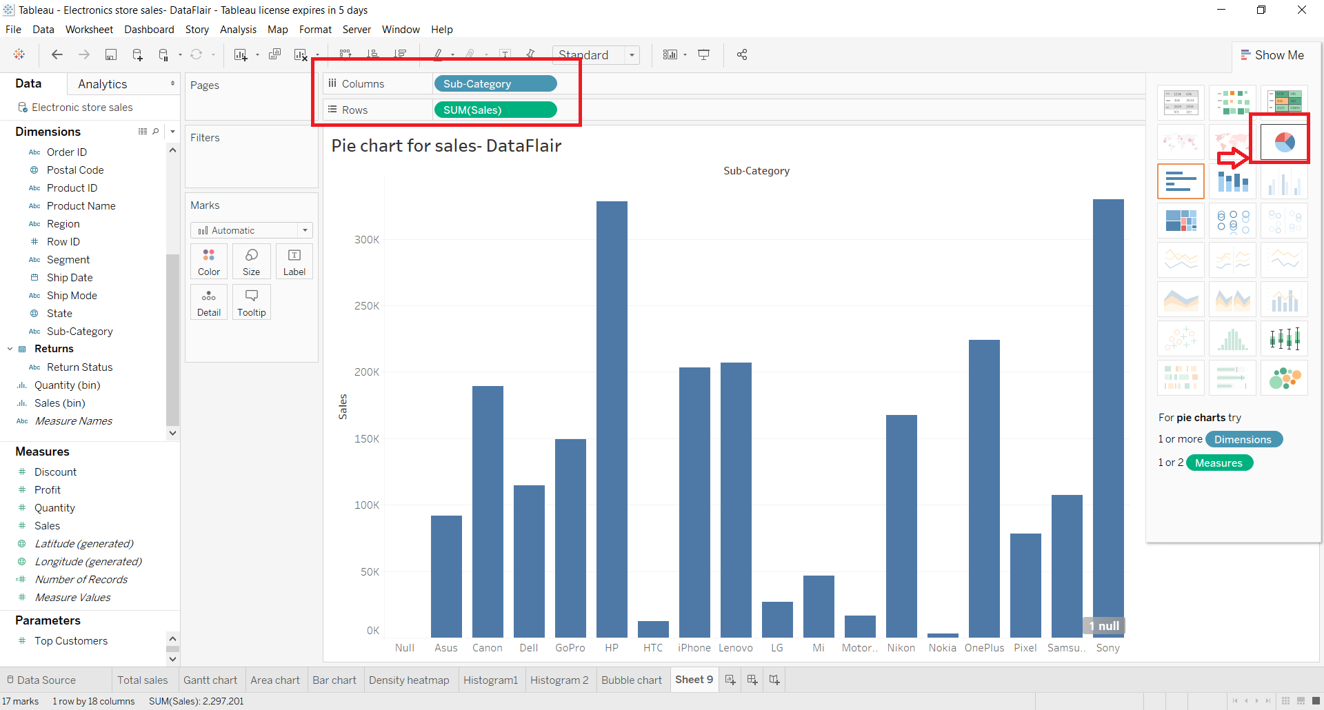
Step 2: Increase Size of the Tableau Pie Chart
As you can see in the screenshot below, a small pie chart appears on the editing pane. You can increase the size of the pie chart by pressing and holding Shift+Ctrl and B. Click on B several times to keep on increasing the size until it gets to the size of your choice. You can also perform this operation from the Size option present in the Marks section.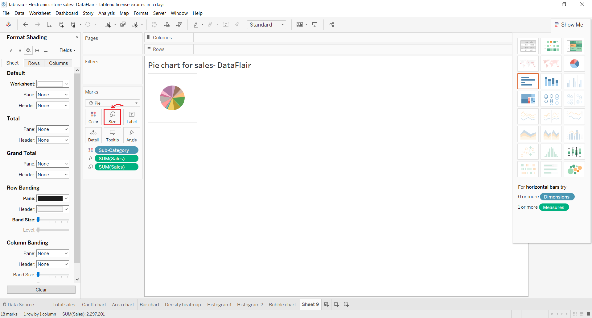
Step 3: Drag and Drop Dimensions to Label Card
Now, you will have all the selected fields in the Marks section. You can drag and drop fields from dimensions or measures section to the Label card to add labels on the pie chart. As you can see in the screenshot below, we added a field named Sub-Category into the pie chart. This adds the names of all the brands or subcategory items on each segment of the pie.
You can similarly add details and colors for the pie chart.
Step 4: Access Formatting Options
Tableau gives us a lot of formatting options for the pie chart as well. You can make a pie chart look just as you like from the Format option. To access the formatting options, right-click on the pie chart and select Format.. option.
On the left, a Format pane will appear having numerous options for formatting the pie chart such as text editing, borders, background, shading, etc. Make changes as per your liking and have a pie chart of your choice.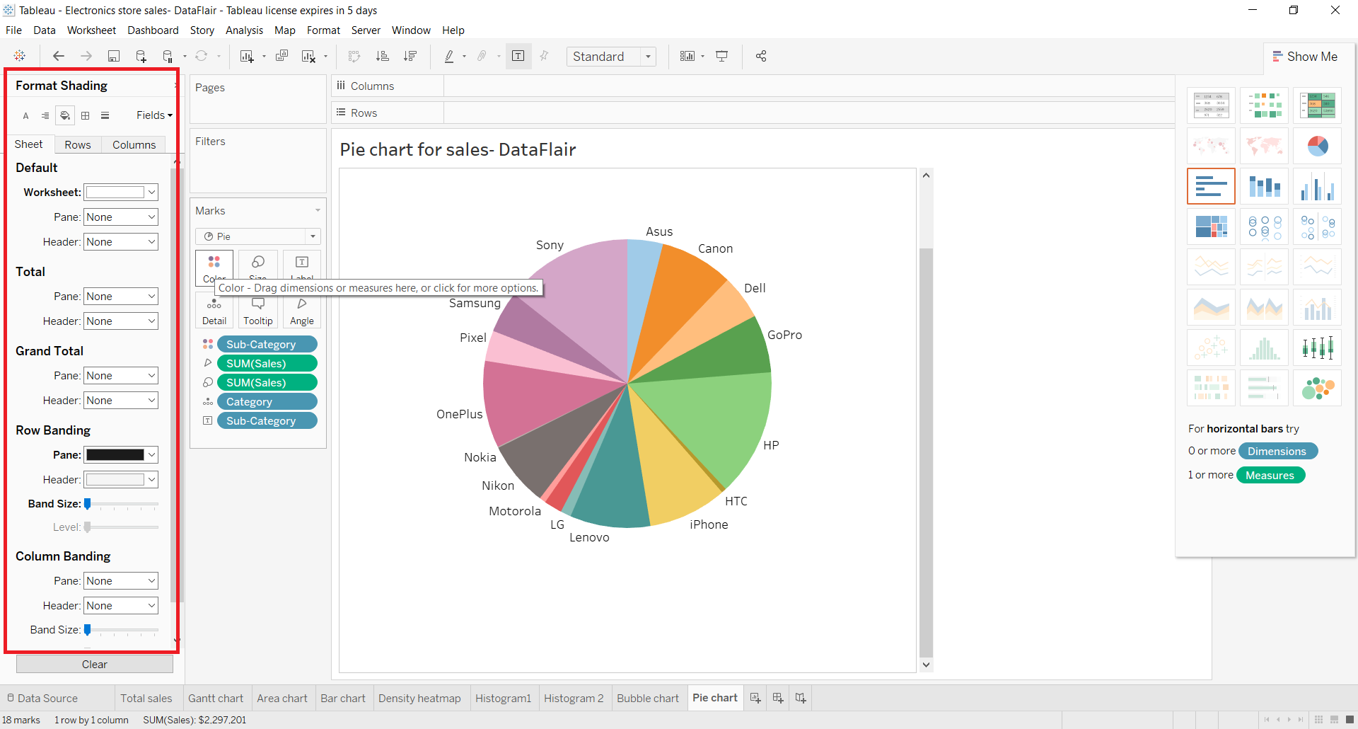
Step 5: Check the Pie Chart Showing Total Sales
In this way, our pie chart representing the total sales of each subcategory or electronic brand is ready. You can hover your cursor over different colored sections of the pie and see details specific to it.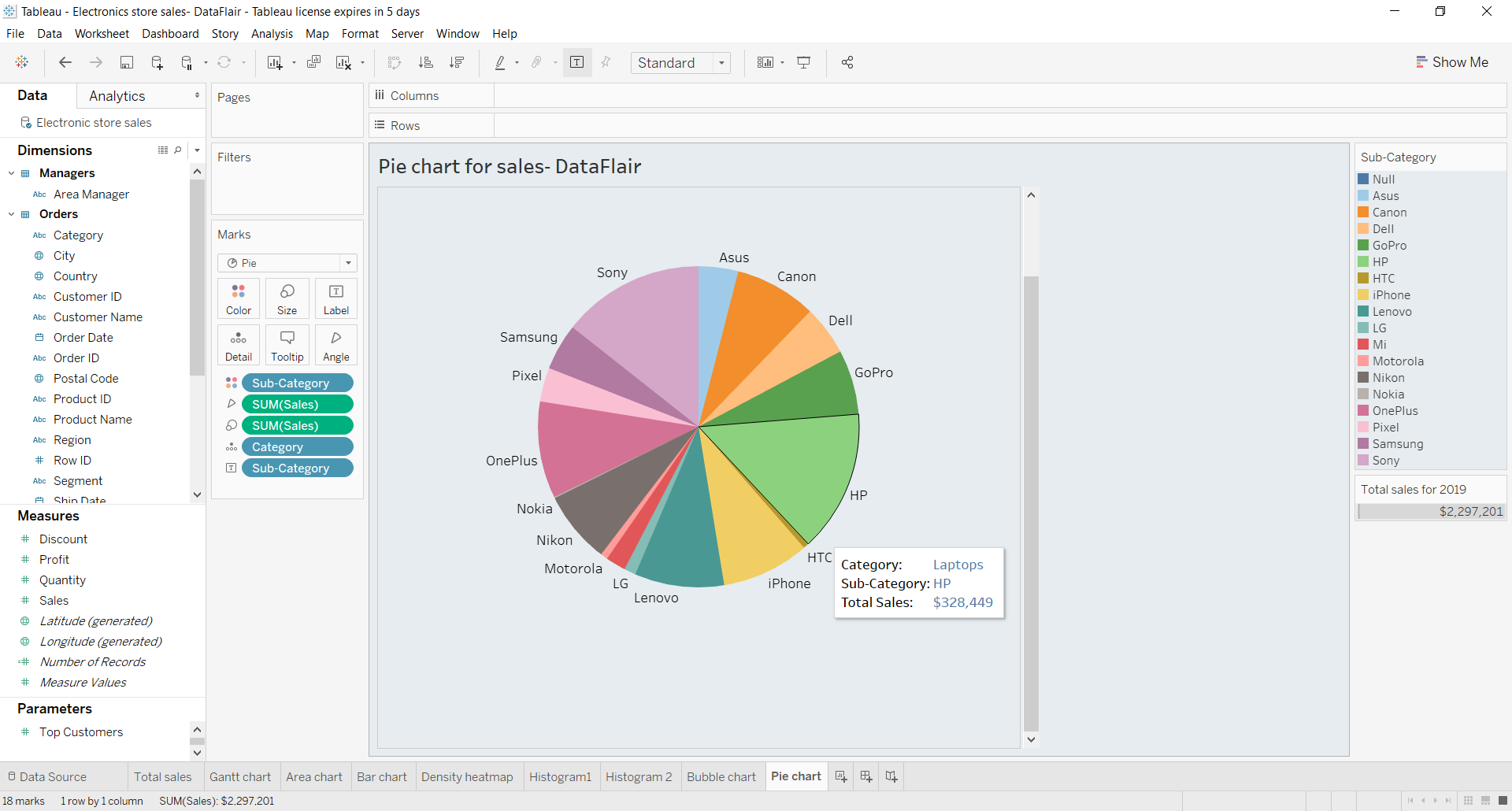
Step 6: Analyse Another Pie Chart
Given below is another pie chart showing category as well as region-wise sales of an electronic store. Please note that while creating pie charts, we suggest that you always use broad categories rather than densely segmented categories.
For instance, you can analyze your pie chart better if you use the Category field than the Sub-category field as there will be lesser category types than subcategory types. This does not clutter the pie chart much and divides it into proper segments for us to analyze.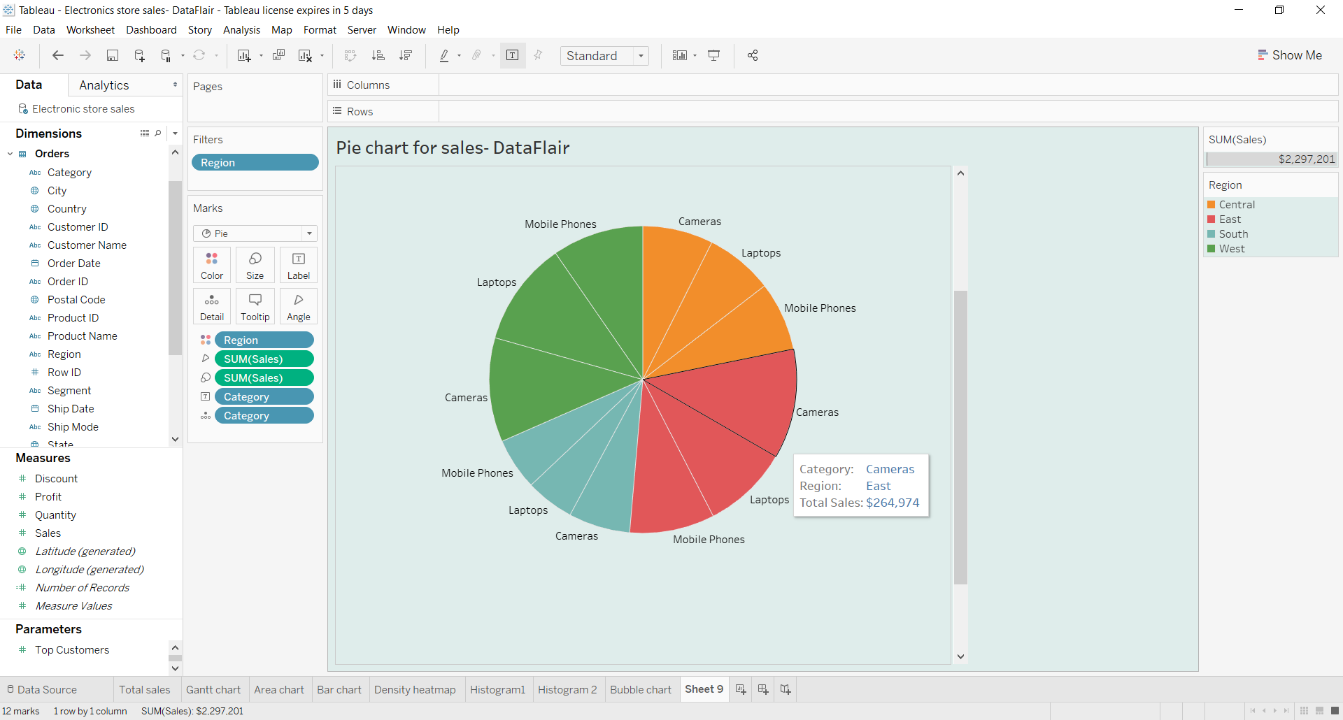
Summary
This was all about the pie chart in Tableau. We hope you could learn something of value from the Tableau Pie Chart tutorial.
This is the right time to visualize your data to the fullest with tableau bullet Chart.
Now you can create pie charts in Tableau as per your dataset and requirements and use it in your dashboards. If you are having any problem in any of the above steps while creating your tableau pie chart, you can mention it in the comment section. We will be happy to help you.
Happy Learning😃
Did we exceed your expectations?
If Yes, share your valuable feedback on Google