Tableau Heat Map – Make your First Heat Map With Us
FREE Online Courses: Enroll Now, Thank us Later!
In this Tableau tutorial, we are going to learn what is a heat map and what are the steps to create a Tableau Heat Map. You might be thinking, how and from where to start and what are the requirements to make this chart. I know, I know so many questions are there in your mind. Don’t worry we have answers to all your questions. All you have to do is first, open your Tableau software on your device and then follow the below steps with us. (Note: We are using Tableau Desktop to make the density heat map).
But wait, before moving on to the steps, first understand the concept of heat map.
What is Heat Map?
A density heat map is used to analyze the areas in a plot where data points are dense or scattered. Heat maps are specifically used where there is a huge data set with overlapping data values. This helps analysts to see the areas with greater density and discover data trends. In the following section, we will learn how to create a density heat map in Tableau.
But before that check the Stacked Bar Chart in Tableau to see the comparison of your data.
How to Create Tableau Heat Map?
Let us learn how to create a heatmap in Tableau. Here, we will create a density heat map using our sample dataset pertaining to sales in an electronics store.
Before we start creating our heatmap, make sure you take care of the points and requirements given below.
- Columns: At least one continuous measure
- Rows: At least one measure or dimension
- Mark type: Density
- Marks card: At least one dimension
Step 1: Add Measure Profit
To begin with, we add a measure Profit to the Columns section.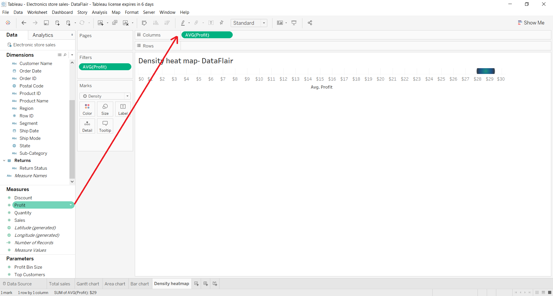
We select the aggregation type as AVG, that is, an average of the field values. Also, we make sure that our measure is Continuous type.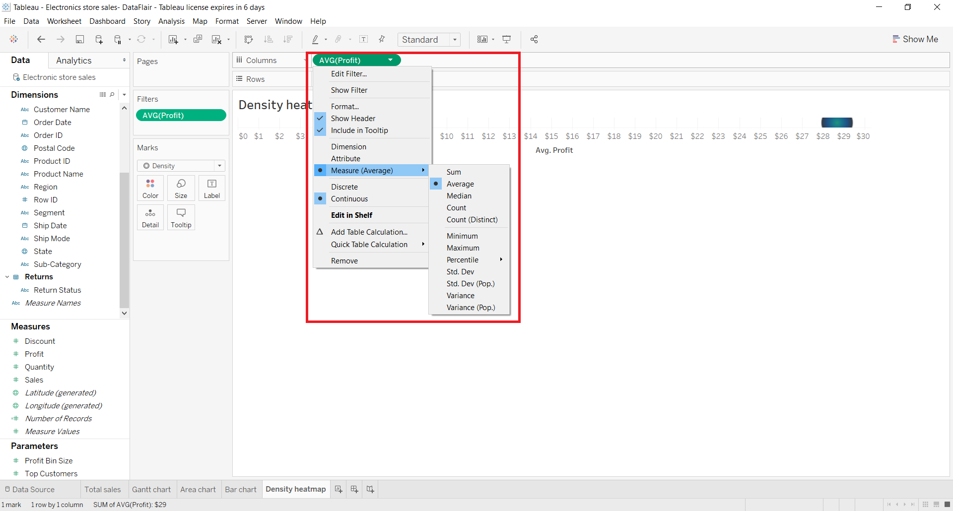
Step 2: Add Measure to Rows Section
Next, we add one more measure field; Sales to the Rows section and again select Average of the field values. You can set the aggregation type as you like and as per your analytical requirements.
As you can see in the image below, an empty plot with two axes appears on the canvas.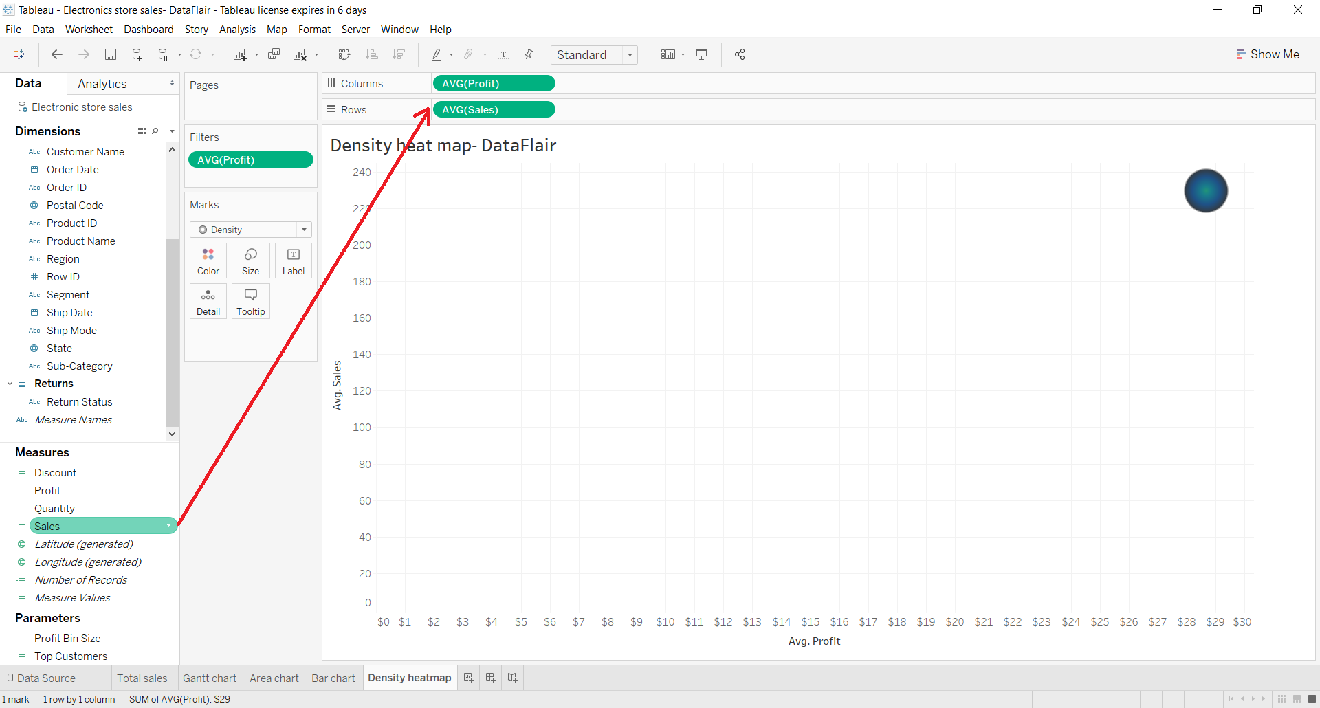
Step 3: Add Dimension Field
Next, we put a dimension field, State into Detail card present in Marks section. This will add a group circle representing different states on the plot showing average sales and average profit for each state.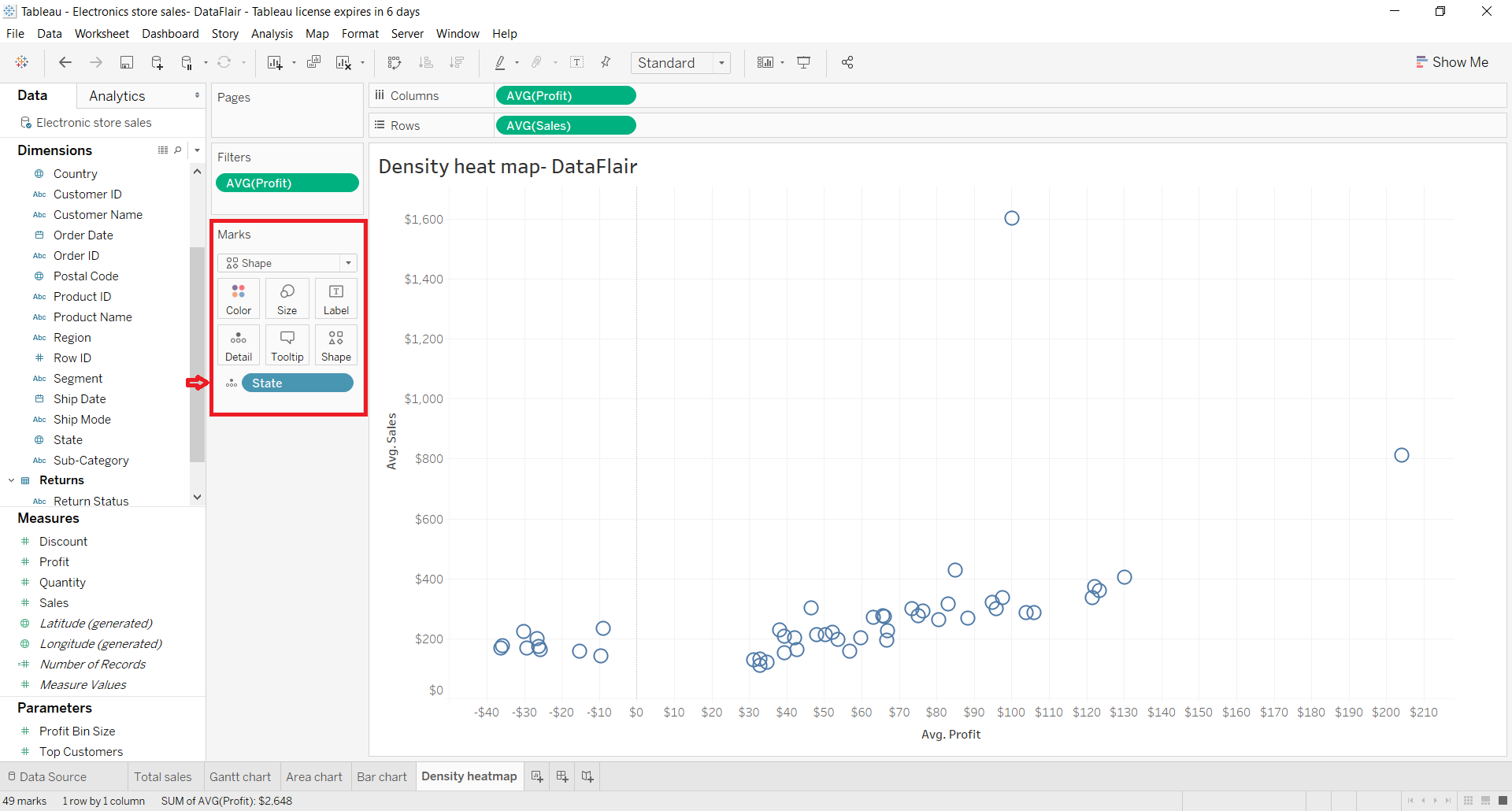
Step 4: Select Density Mark
Now, we’ll convert this plot into a density heat map by selecting the Shape as Density. This will change the shape of data points from circles to density spots. That is, the color scheme of data points will follow a density gradient.
The regions with most data points or dense regions will be in red/orange whereas, the areas with lesser or scattered data points appear in greenish-blue shades. You can select color schemes of your choice for heat maps.
Step 5: Set Intensity and Opacity
To select a color scheme of your choice, right-click on Color card and explore the options. From here, we can also set the intensity, opacity and other border effects for the heat map.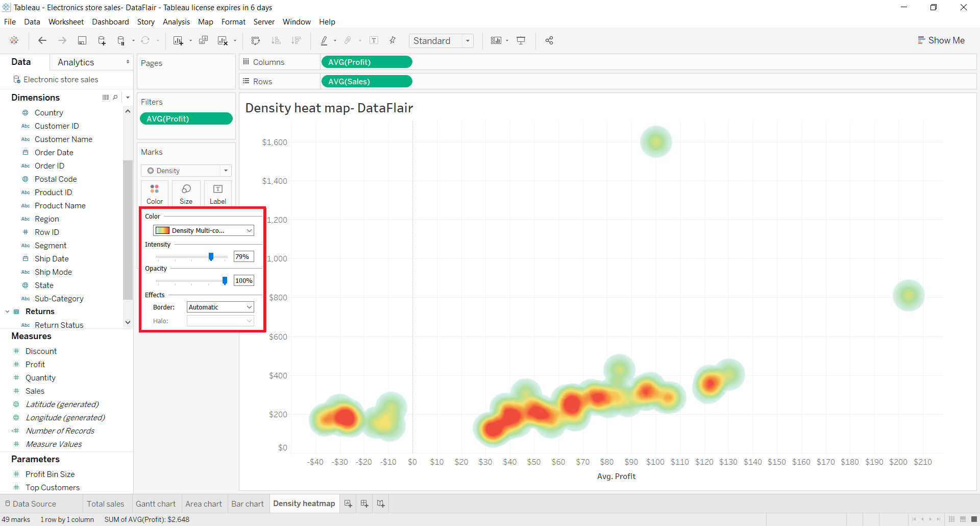
We can select the color scheme from a long list of available options.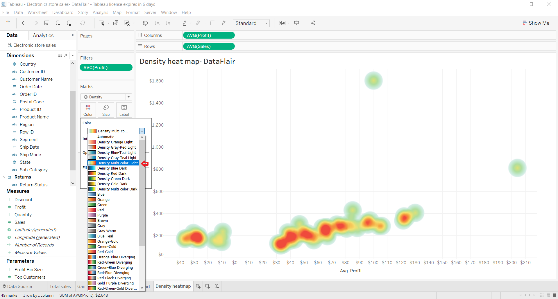
Step 6: Set Size of Tableau Heat Map
We can also increase or decrease the size of density spots.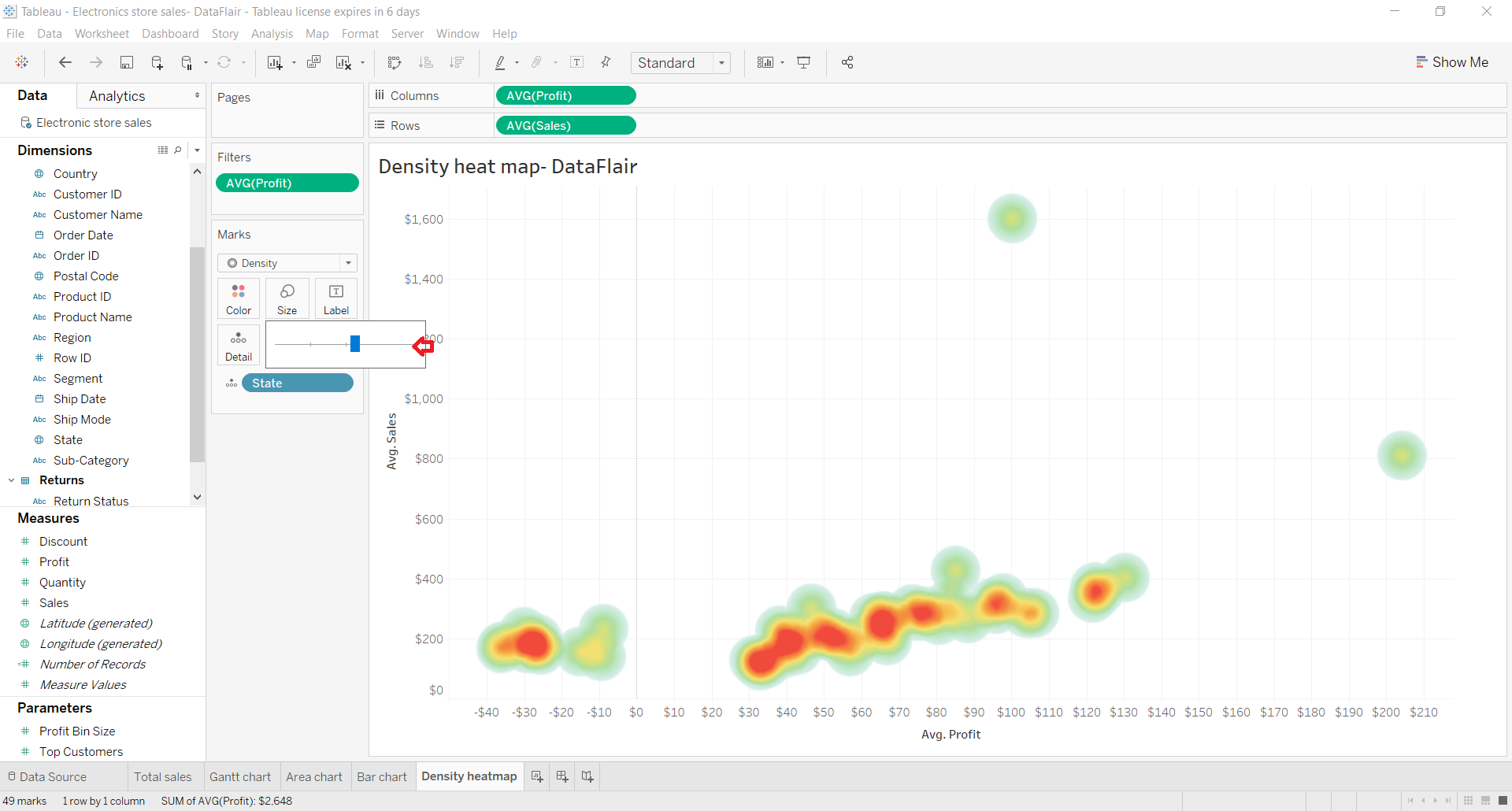
Step 7: Create Final Tableau Heat Map
In this way, we create a heat map or density heat map in Tableau. To see more details of the data points in the map, hover your cursor on the density points. We can see all the relevant details on the text label.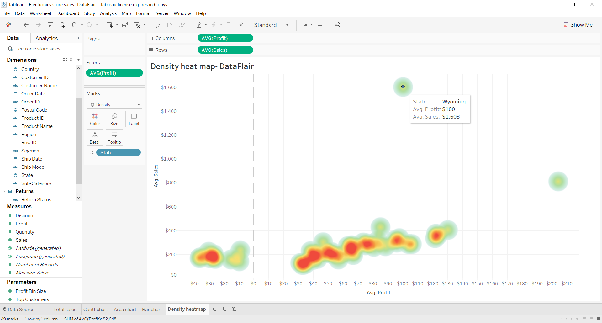
Summary
This concludes our tutorial on Tableau Heat Map. Now, you should explore how to create Pie Chart in Tableau to check the part-to-whole relationship of your data. I hope this article was helpful to you and you have learned how to create a density heat map in your Tableau software. In case if you have any queries in any of the above steps, mention them in the comment section below, our experts will guide you.
Happy Learning!!
Did you know we work 24x7 to provide you best tutorials
Please encourage us - write a review on Google