RStudio Tutorial – A Complete Guide for Novice Learners!
FREE Online Courses: Click, Learn, Succeed, Start Now!
RStudio is one of the most popular IDE for working with the R programming language. Here in this RStudio tutorial, we’re going to cover every aspect of RStudio so that you can have its thorough understanding.
In this RStudio tutorial, we are going to perform the following operations:
- Downloading/Importing Data in R.
- Data Transformation and other Miscellaneous Data Operations.
- Performing Statistical Modeling on the Data.
- Creating Graphical Plots of Data.
What is RStudio?
RStudio is an open-source integrated development environment that facilitates statistical modeling as well as graphical capabilities for R. It makes use of the QT framework for its GUI features.
There are two versions of RStudio – RStudio Desktop and RStudio Server.
RStudio desktop provides facilities for working on the local desktop environment, whereas RStudio Server provides access through a web browser.
You should be aware of the Statistical Programming in R
Basic Data Analysis through RStudio
We will perform data analysis using RStudio in this section. We will also perform data transformation as well as graphical plotting of the resulting data distribution.
How to Import Data in RStudio?
In order to deploy our model in RStudio, we will make use of the ACS (American Community Survey) dataset. We can import this data through the following command that is typed in the console window.
> ACS_data <- read.csv(url("http://stat511.cwick.co.nz/homeworks/acs_or.csv"))Output:
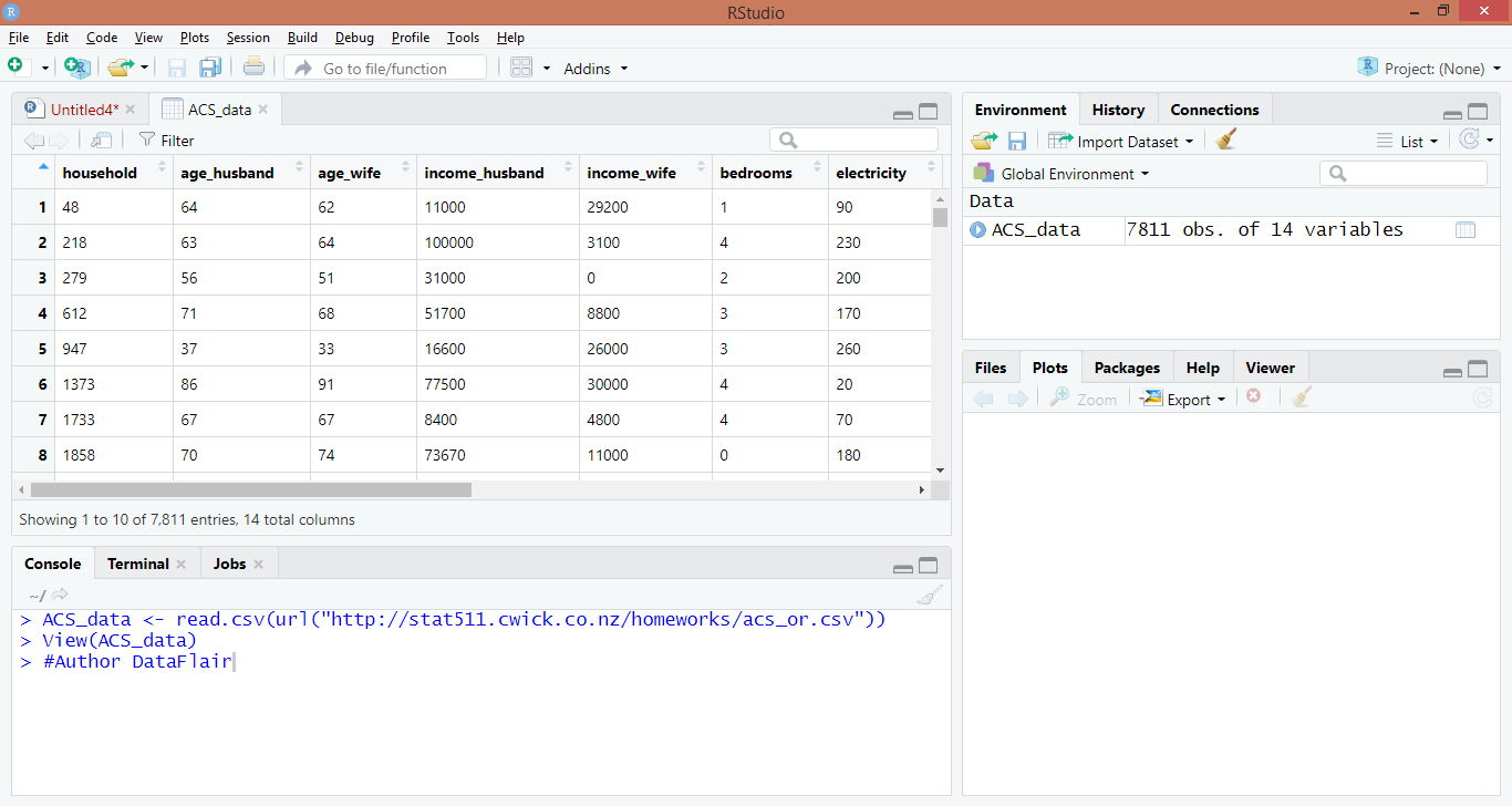
After this command is executed in RStudio, the entire ACS dataset will be loaded into the ACS_data object in the form of a CSV file.
Are you aware of the Process of Importing Data in R? If not, then you should definitely learn it.
How to Transform Data through RStudio?
After you have imported data into your variable in RStudio, you can now apply various transformations to manipulate the data. Some techniques for accessing the data are as follows.
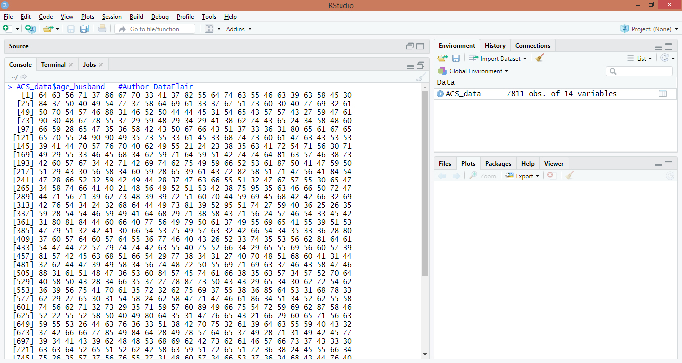
In order to access the label age_husband, we use the following command:
> ACS_data$age_husband #Author DataFlair
Output:
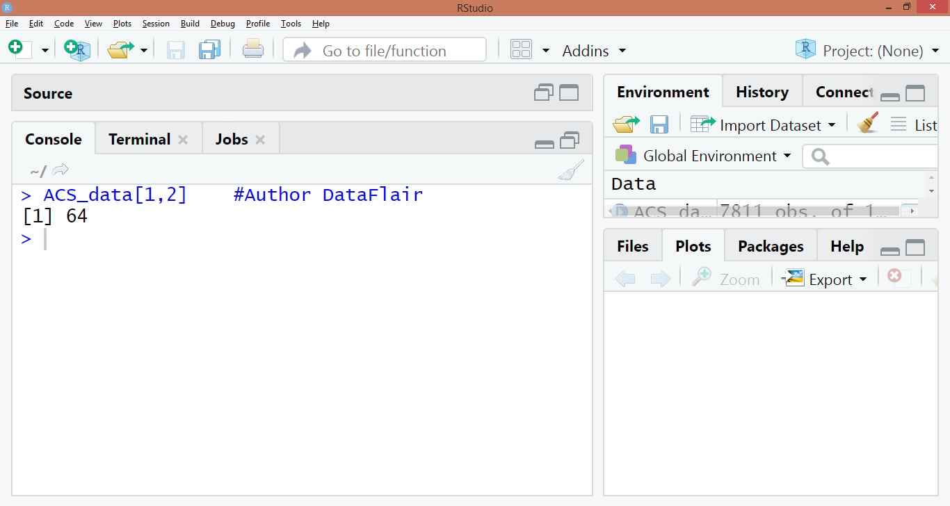
To access data as a vector, use this:
> ACS_data[1,2] #Author DataFlair
Output:
If you want to retrieve the data for which age_husband is greater than the label age_wife, then we will execute the following command:
> greater <- subset(ACS_data , age_husband > age_wife) #Author DataFlair
> head(greater)
Output:

In the above code, we use the function ‘subset’ and within this function, we specify our data upon which the greater than operation is to be applied. The second parameter performs this condition. Finally, we display the first 6 values that return the values for which age_husband is greater than age_wife.
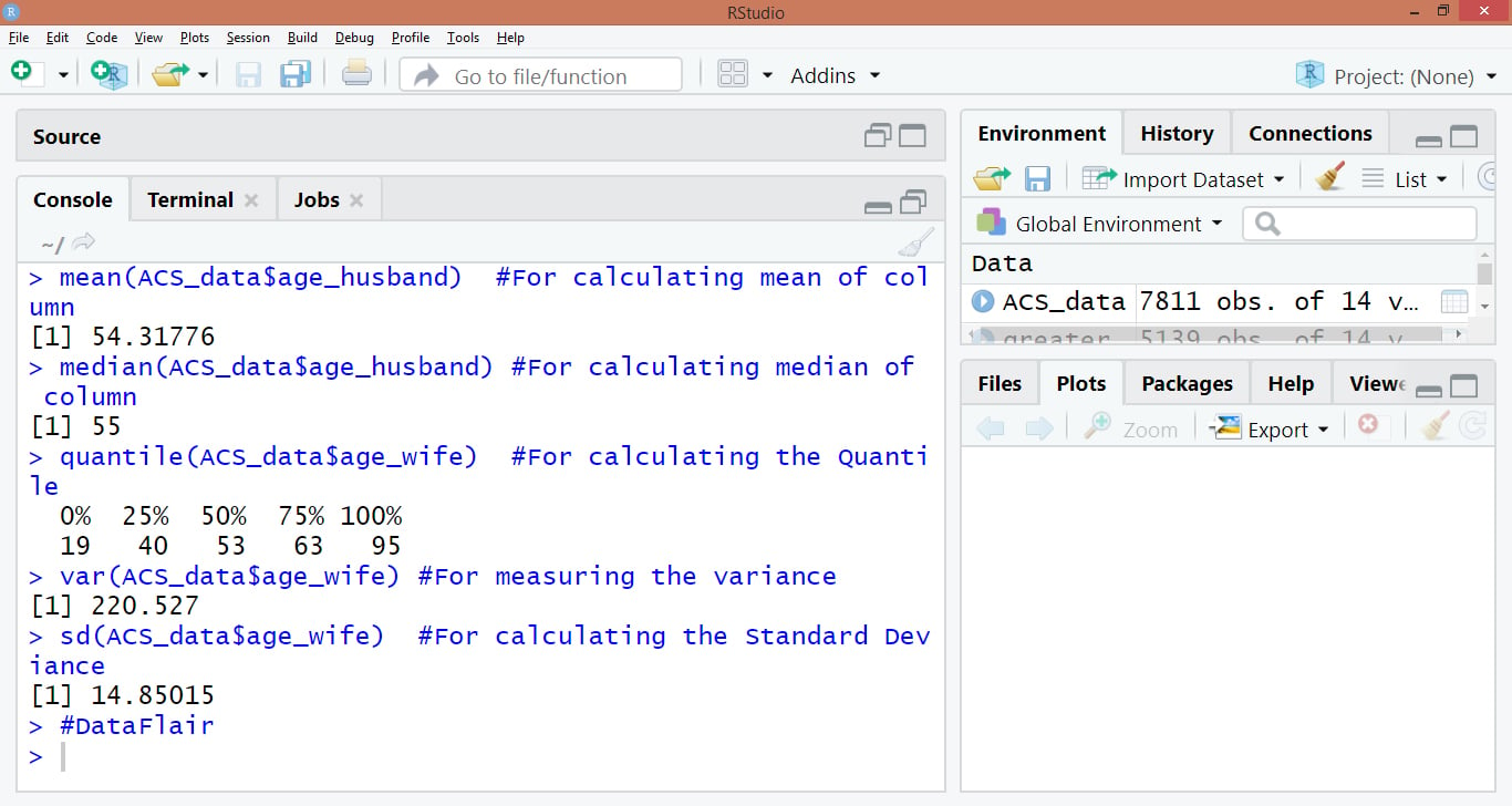
We can perform various statistical operations as follows:
> mean(ACS_data$age_husband)  #For calculating mean of column
> median(ACS_data$age_husband) #For calculating median of column
> quantile(ACS_data$age_wife)  #For calculating the Quantile
> var(ACS_data$age_wife) #For measuring the variance
> sd(ACS_data$age_wife)  #For calculating the Standard Deviance
> #DataFlair
Output:
For retrieving a summary of the dataset, we use the summary() function:
> summary(ACS_data) #Author DataFlair

RStudio provides advanced graphics visualization features. We can plot our above data with the column label ‘age_husband’ on the x-axis and column age_wife on the y-axis.
A scatterplot is plotted in the following manner:
> sub <- ACS_data[1:100, ] #Author DataFlair
> plot(x = sub$age_husband , y = sub$age_wife, type = 'p')
Output:
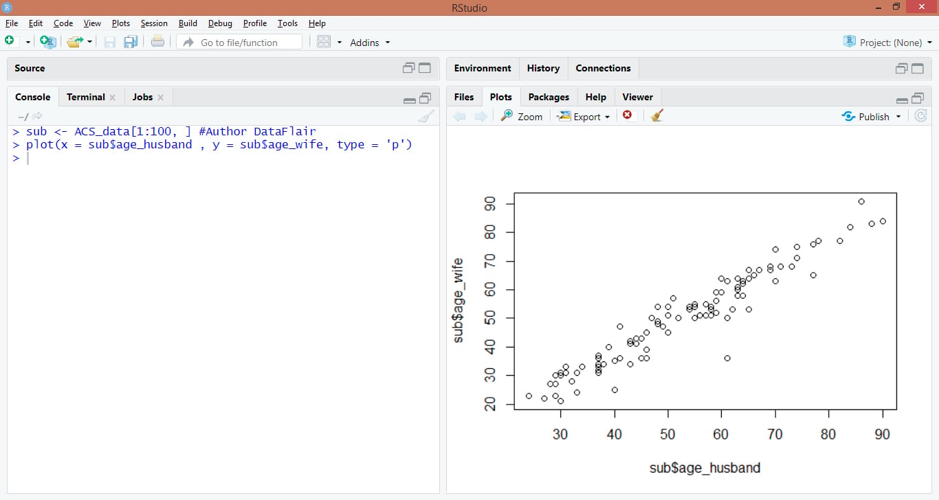
We first created a subset called ‘sub’ that contains only 100 rows. We will plot the variables that are pertaining to these 100 rows.
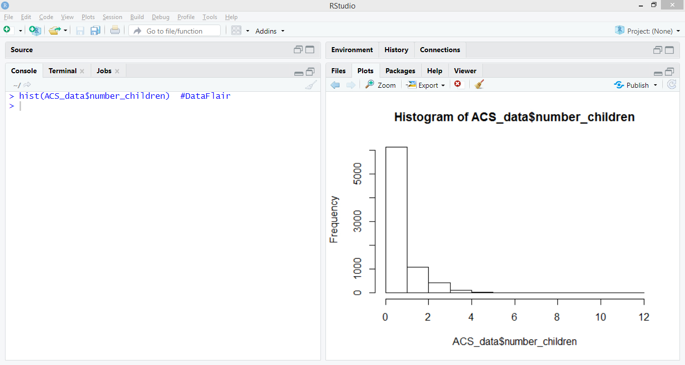
In order to delineate a histogram, we make use of the following command:
hist(ACS_data$number_children)
Output:
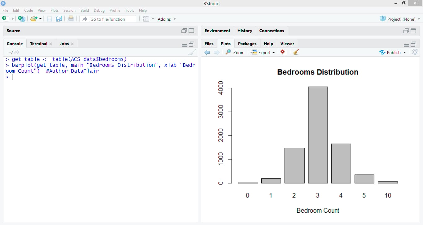
We can create the barplot as follows:
> get_table <- table(ACS_data$bedrooms)
> barplot(get_table, main="Bedrooms Distribution", xlab="Bedroom Count")  #Author DataFlair
Output:
Summary
In this RStudio tutorial, we learned about the basics of RStudio. We inferred how to import data, transform it, perform analysis on the data and finally, visualize the data. We hope that you understood all the processes of RStudio with this article.
Now, the next concept is going to be an interesting one, that is – R Data Structures
If you’re having any difficulties, then let us know in the comment section. Our DataFlair experts will assist you in the best possible way.
Did you know we work 24x7 to provide you best tutorials
Please encourage us - write a review on Google


How to perform Quantile REgression in R Studio?
Very good tutorial. Helpful. Thank you.
Thanks for your kind words. Share the R tutorial with your friends & colleagues on social media & spread the knowledge you gained.
I am interested in this course.
Thank you
Can I access the form that was used for this class?