Tableau Dashboard Tutorial – A Visual Guide for Beginners
FREE Online Courses: Knowledge Awaits – Click for Free Access!
Now that we’ve learned how to create different kinds of charts and graphs in Tableau, the next step is to create a dashboard. Here, we will start by learning to navigate on a new dashboard, understand its sections and panes, and then advance on learning to make perfect dashboards.
Wait! Have you checked the previous tutorial on Tableau Waterfall Charts
Creating a Dashboard in Tableau
A dashboard is a collection of different kinds of visualizations or views that we create on Tableau. We can bring together different elements of multiple worksheets and put them on a single dashboard. The dashboard option enables us to import and add charts and graphs from worksheets to create a dashboard. On a dashboard, we can place relevant charts and graphs in one view and analyze them for better insights.
Now, we will learn in a stepwise manner how to create a dashboard in Tableau Desktop.
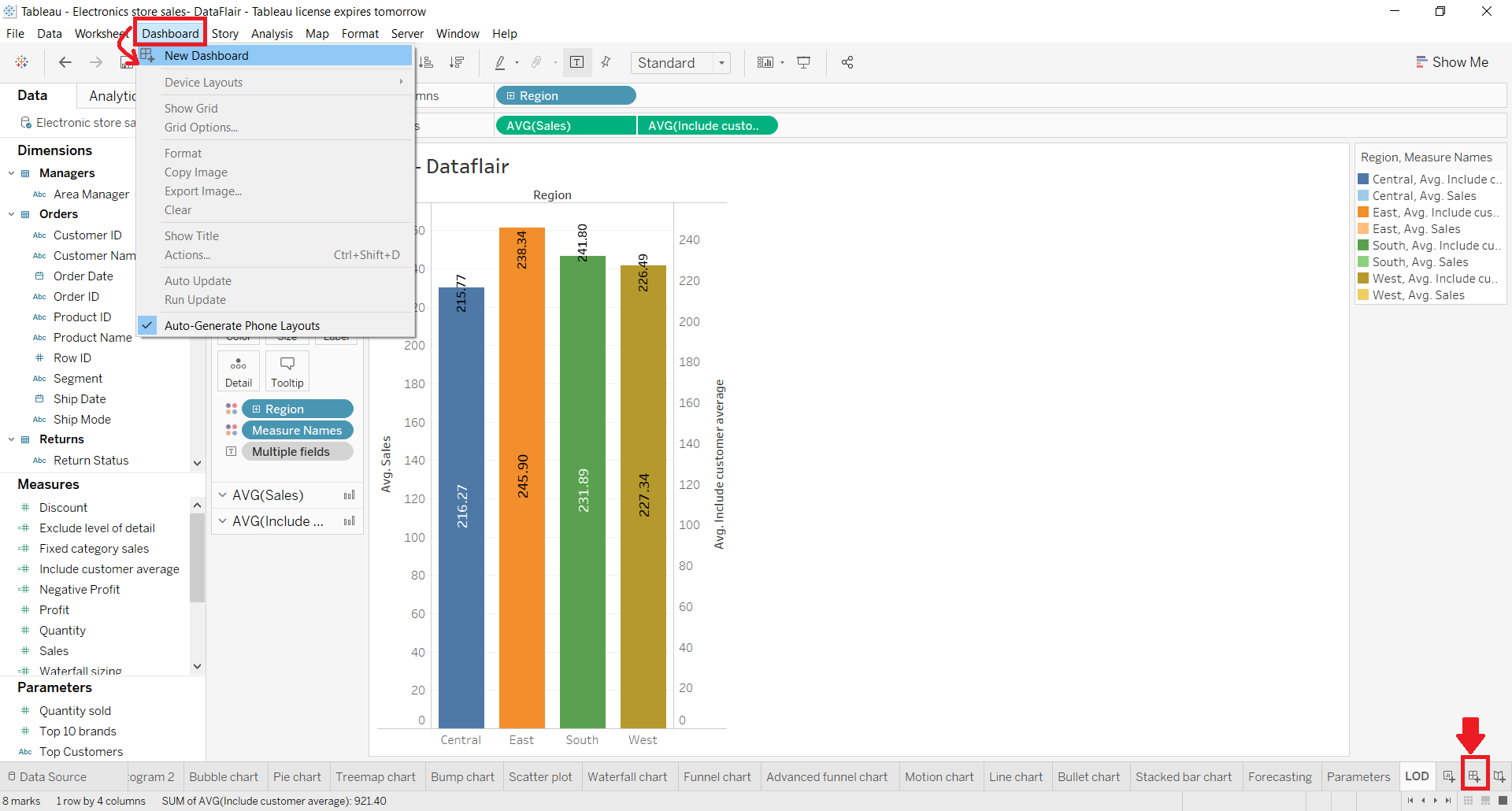
1. Open a new dashboard
You can open a dashboard window either from the Dashboard option given on the menu bar or from the Dashboard icon highlighted in red on the bottom bar.
Selecting the New Dashboard option or clicking on the Dashboard icon will open a new window named Dashboard 1. You change the name of the dashboard as per your liking.
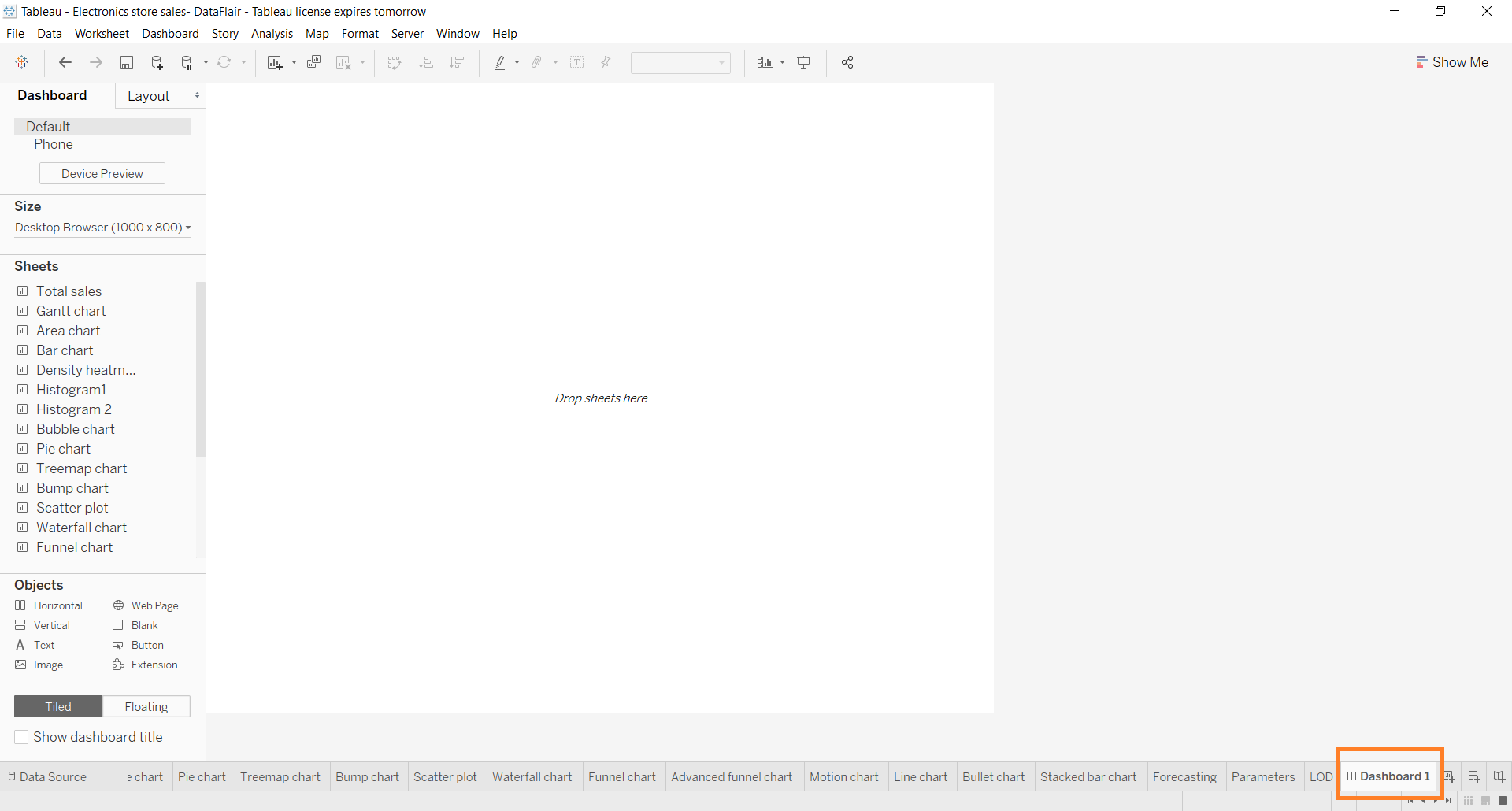
2. Dashboard pane
In the window where we can create our dashboard, we get a lot of tabs and options related to dashboarding. On the left, we have a Dashboard pane which shows the dashboard size, list of available sheets in a workbook, objects, etc.
From the Dashboard tab, we can set the size of our dashboard. We can enter custom dimensions like the width and height of the dashboard as per our requirements.
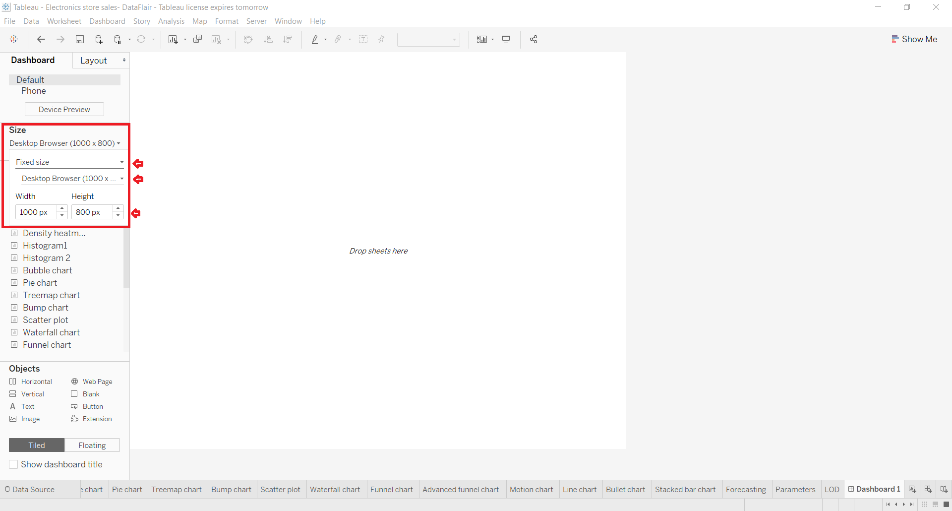
Or, you can select from a list of available fixed dashboard sizes as shown in the screenshot below.

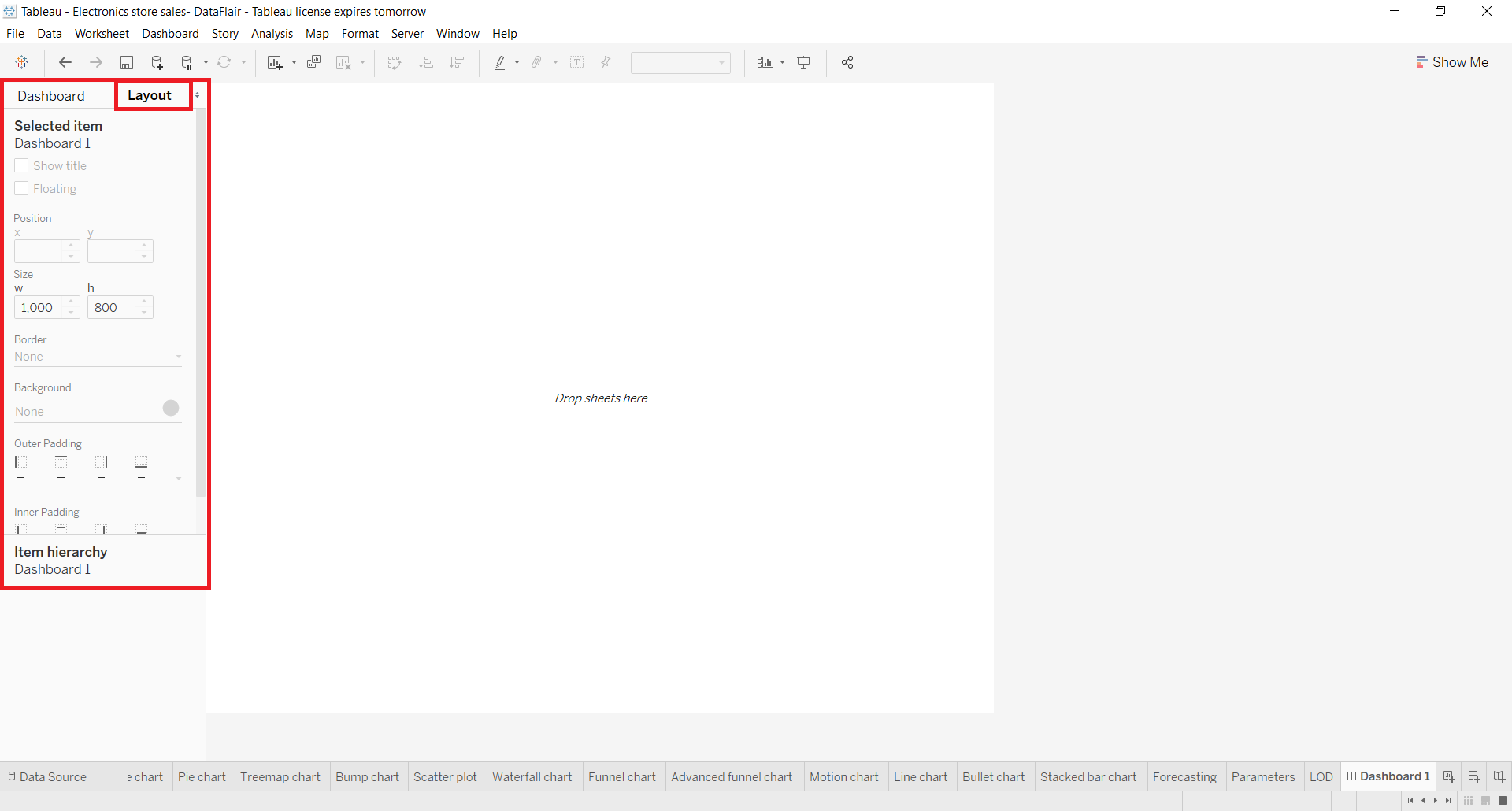
3. Layout pane
Right next to the Dashboard pane is the Layout pane where we can enhance the appearance and layout of the dashboard by setting the position, size, border, background, and paddings.
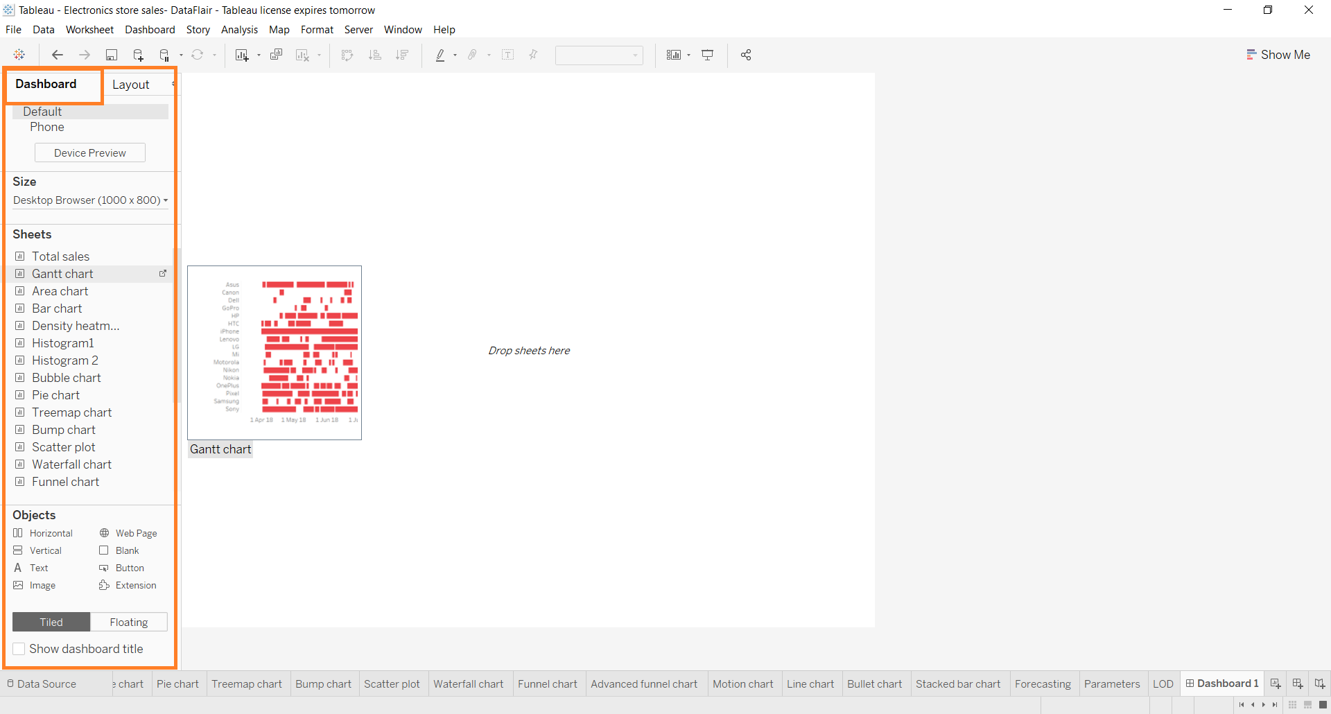
4. Adding a sheet
Now, we’ll add a sheet onto our empty dashboard. To add a sheet, drag and drop a sheet from the Sheets column present in the Dashboard tab. It will display all the visualizations we have on that sheet on our dashboard. If you wish to change or adjust the size and place of the visual/chart/graph, click on the graph then click on the small downward arrow given at the right. A drop-down list appears having the option Floating, select it. This will unfix your chart from one position so that you can adjust it as per your liking.
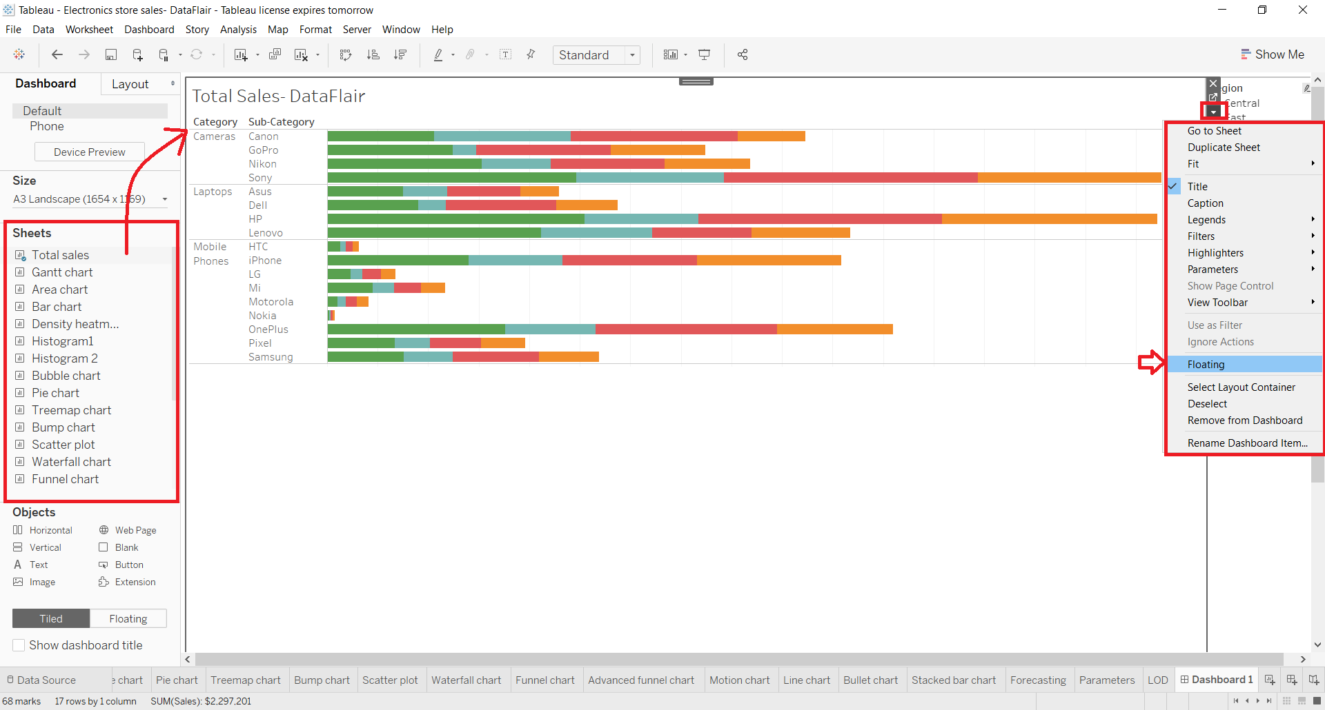
Have a look at the picture below to see how you can drag a sheet or visual around on the dashboard and adjust its size.

5. Adding more sheets
In a similar way, we can add as many sheets as we require and arrange them on the dashboard properly.
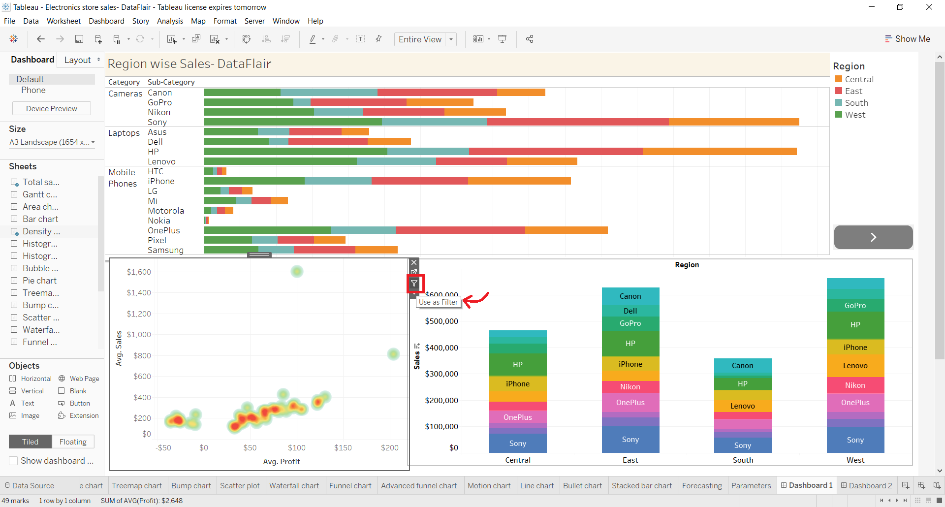
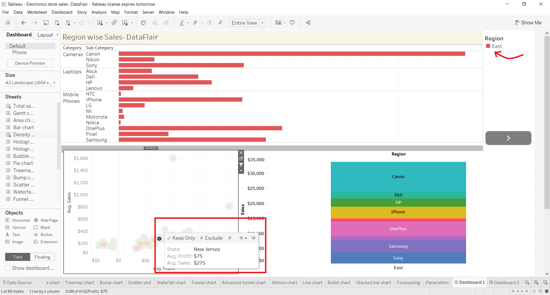
Also, you can apply the filter or selections on one graph and treat it like a filter for all the other visuals on the dashboard. To add a filter to a dashboard in Tableau, select Use as Filter option given on the right of every visual.
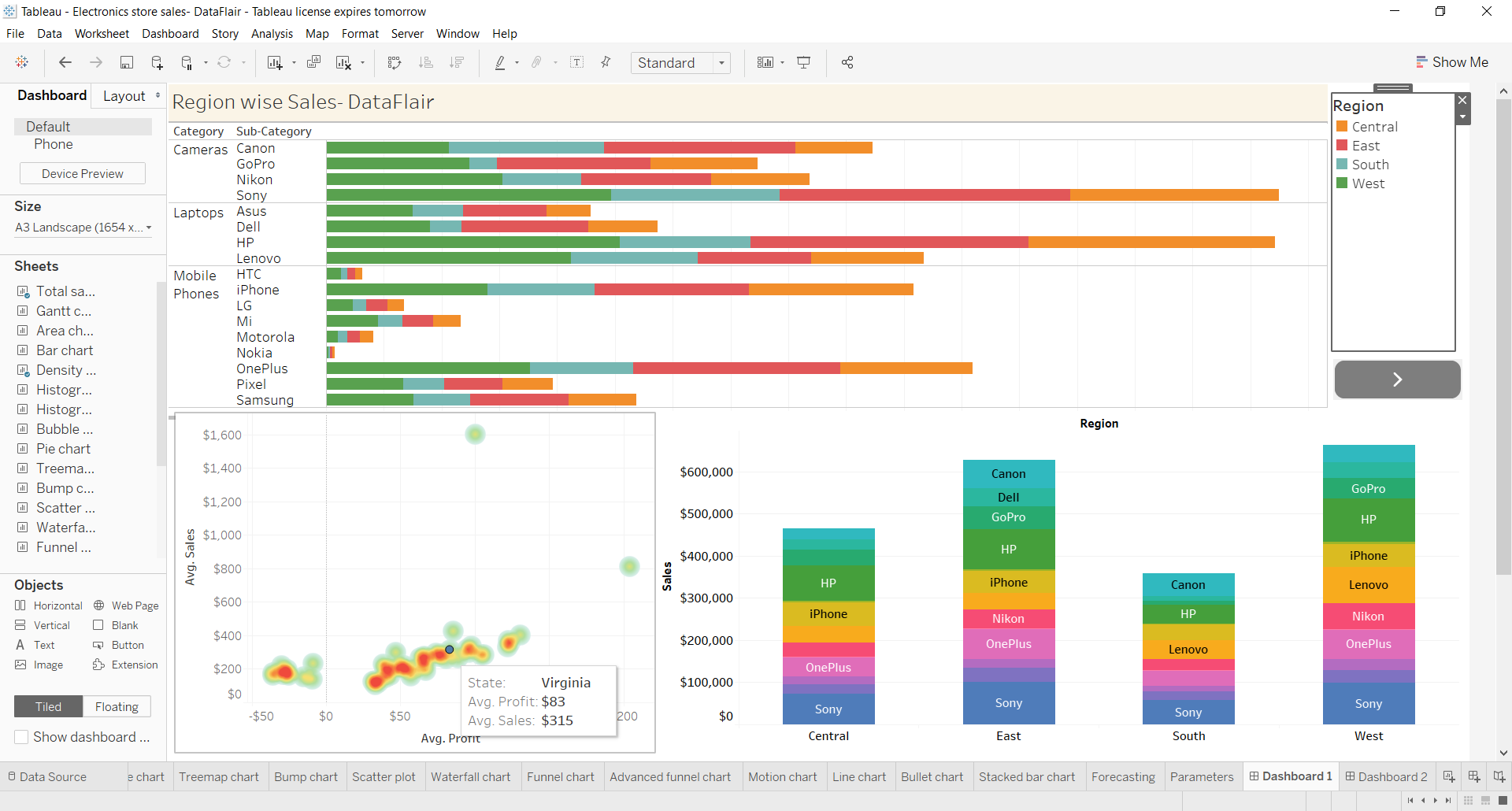
Then on the selected visual, we make selections. For instance, we select the data point corresponding to New Jersey in the heat map shown below. As soon as we select it, all the rest of the graphs and charts change their information and make it relevant to New Jersey. Notice in the Region section, the only region left is East which is where New Jersey is located.
6. Adding objects
Another set of tools that we get to make our dashboard more interactive and dynamic is in the Objects section. We can add a wide variety of objects such as a web page, button, text box, extension, etc.
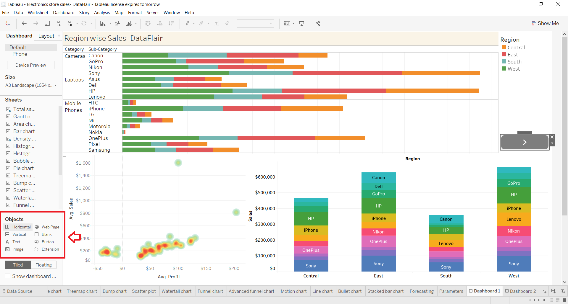
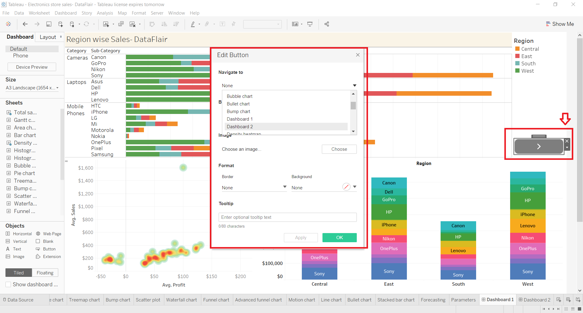
From the objects pane, we can add a button and also select the action of that button, that is, what that button should do when you click on it. Select the Edit Button option to explore the options you can select from for a button object.
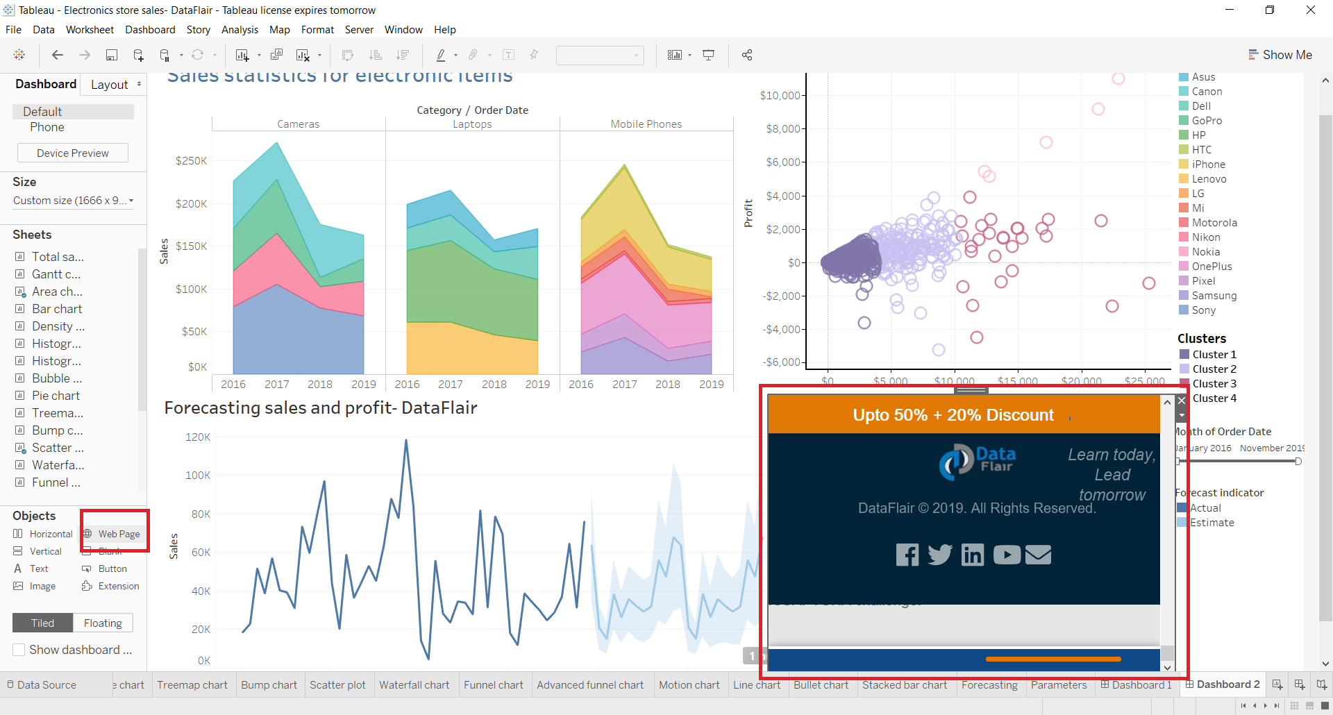
For instance, we add a web page of our DataFlair official site as shown in the screenshot below.
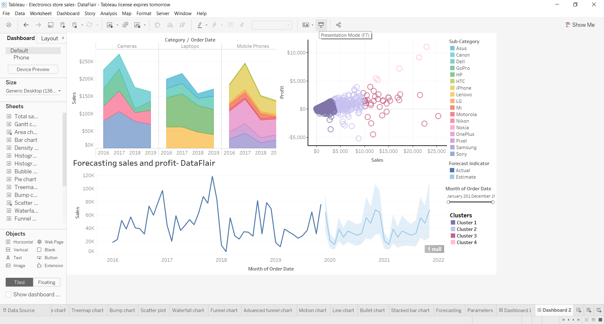
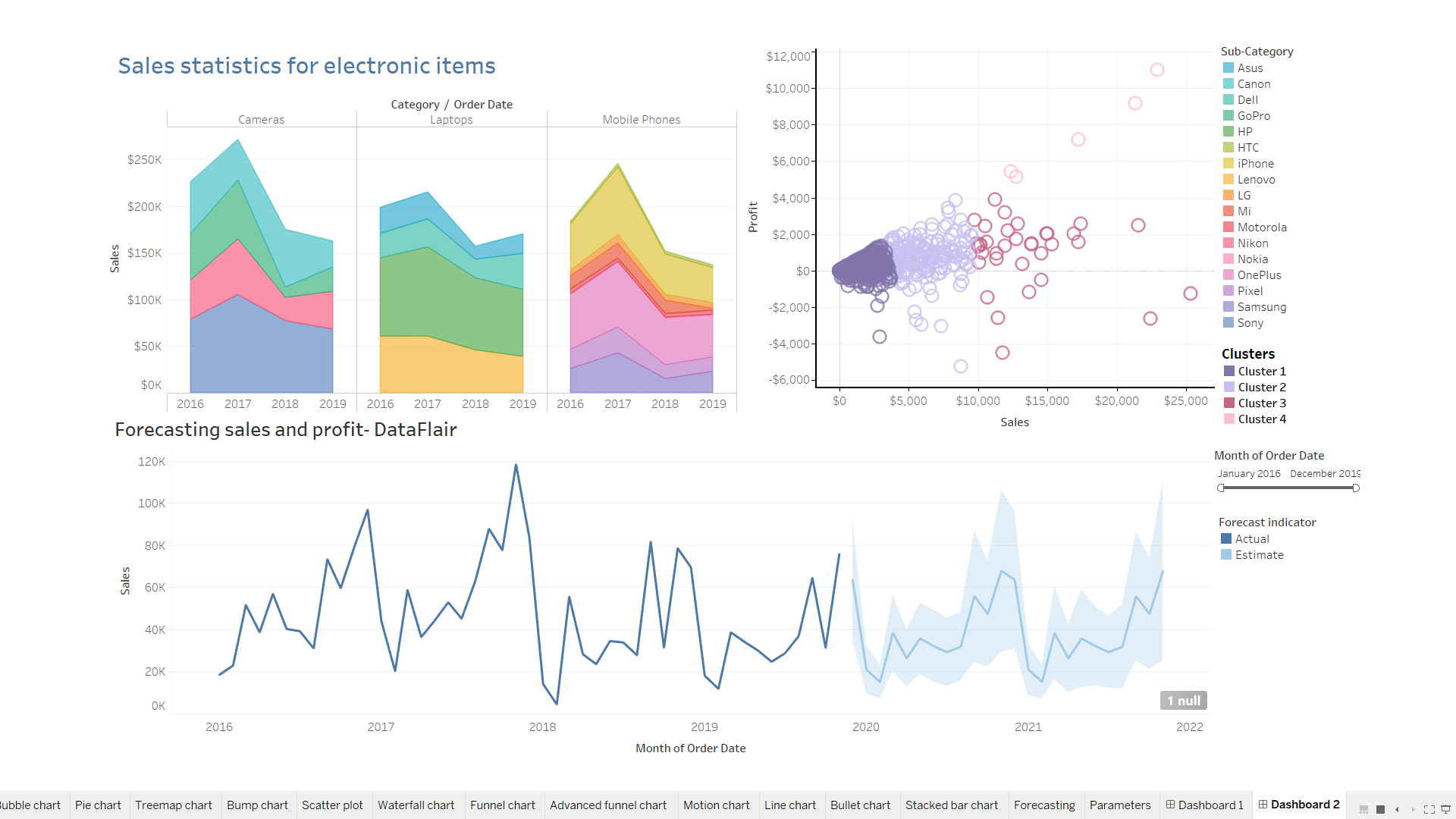
7. Final dashboard
Now, we move towards making a final dashboard in Tableau with all its elements in place. As you can see in the screenshot below, we have three main visualizations on our current dashboard i.e. a segmented area chart, scatter chart and a line chart showing the sales and profits forecast. On the right pane, we have the list of legends showing Sub-category names, a forecast indicator and a list of clusters.
We can add filters on this dashboard by clicking on a visual. For instance, we want to add a filter based on months on the scatter plot showing sales values for different clusters. To add a months filter, we click on the small downward arrow and then select Filters option. Then we select Months of Order Date option. You can select any field based on which you wish to create a new filter.
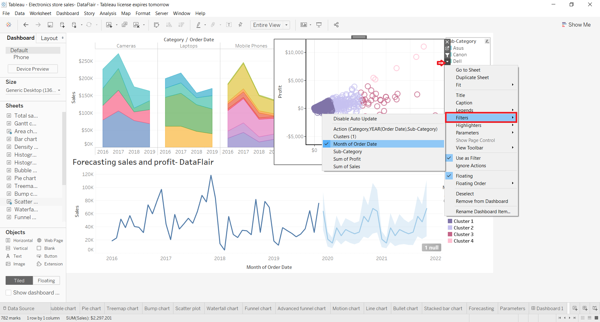
This will give us a slider filter to select a range of months for which we want to see our data. You can adjust the position of the filter box and drag and drop it at whichever place you want.
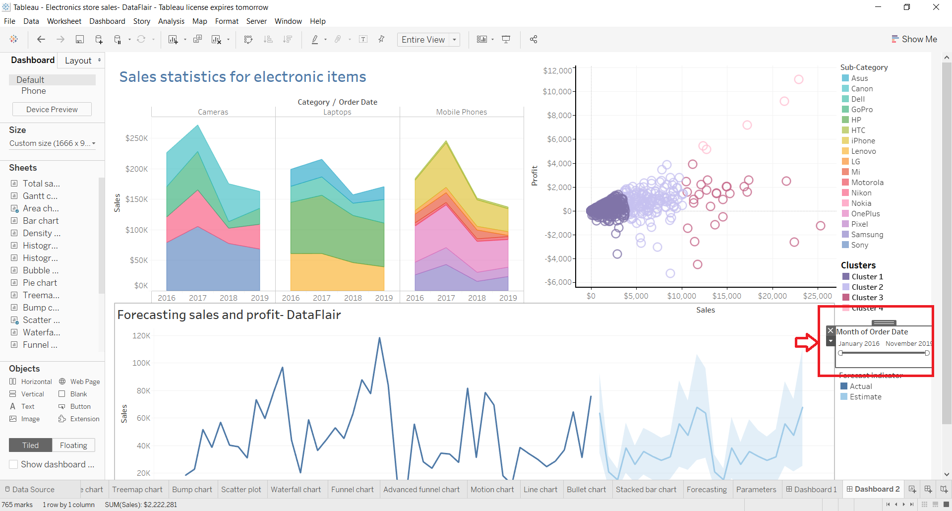
You can make more changes into the filter by right-clicking on it. Also, you can change the type of filter from the drop-down menu such as Relative Date, Range of Date, Start Date, End Date, Browse Periods, etc.
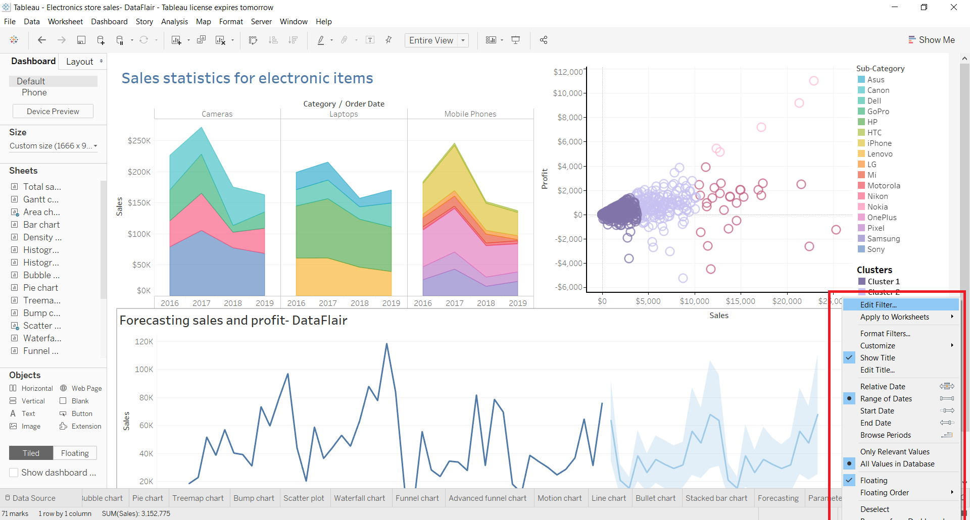
Similarly, you can add and edit more filters on the dashboard.
8. Presentation mode
Once our dashboard is ready, we can view it in the Presentation Mode. To enable the presentation mode, click on the icon present on the bar at the top as shown in the screenshot below or press F7.
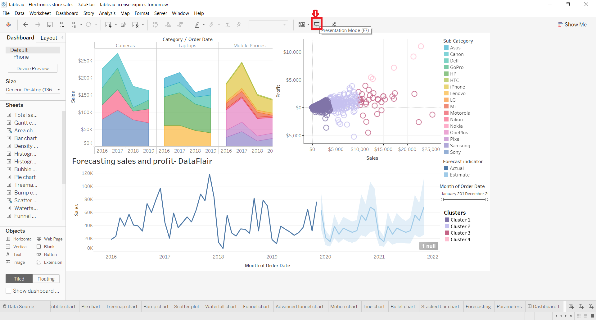
This opens our dashboard in the presentation mode. So far we were working in the Edit Mode. In the presentation mode, it neatly shows all the visuals and objects that we have added on the dashboard. We can see how the dashboard will look when we finally present it to others or share it with other people for analysis.
Here, we can also apply the filter range to our data. The dashboard is interactive and will change the data according to the filters we apply or selections we make.

For instance, we selected the brand Pixel from our list of items from the sub-category field. This instantly changes the information on the visuals and makes it relevant to only Pixel.
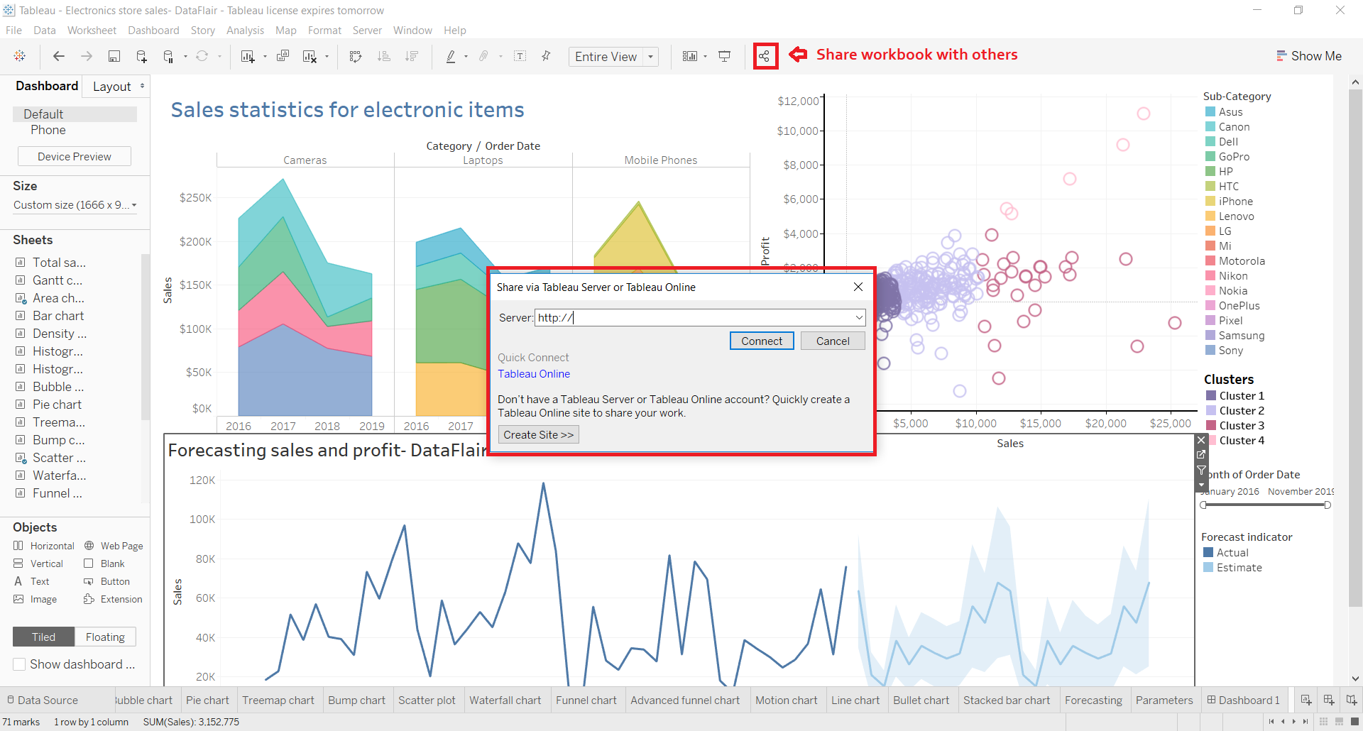
9. Share workbook with others
We can also share all the worksheets and dashboard that we create together as a workbook with other users. To share the workbook with others, click on the share icon (highlighted in red). Next, you need to enter the server address of a Tableau server.
Note – You must have a Tableau Online or Tableau Server account in order to do this.
Summary
In this Tableau Dashboard tutorial, we learned how to create a dashboard from scratch. We started with learning how to add visuals from distinct sheets into a single dashboard and how to arrange or format them as per our preference. Then we moved on to learning how to add different kinds of objects, add filters, and view our dashboard in presentation mode. We hope all this knowledge is enough to give dashboard making in Tableau a good start.
Next tutorial lined up for you – Tableau Formatting
This concludes our tutorial on how to create a dashboard in Tableau. We hope you found it to be helpful. If you have any suggestions or doubts, please leave your comments in the comment box below.
We work very hard to provide you quality material
Could you take 15 seconds and share your happy experience on Google