Python Charts – Bubble, 3D Charts with Properties of Chart
Python course with 57 real-time projects - Learn Python
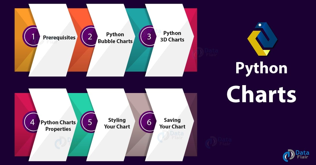
1. Python Charts – Objective
In our last tutorial, we studied Python Array Module. Today, we will take a quick look at Python Charts. Here, we will cover the Python Bubble Charts and 3D charts in Python. Then, we’ll learn about the properties of Python charts and will try to style those charts in Python programming.
Python Charts – Bubble, 3D Charts with Properties of Chart
2. Prerequisites for Python Charts
For this Python Chart tutorial, we will import three libraries- matplotlib, numpy, and pandas.
You can install these Python Libraries using the following commands-
pip install matplotlib
pip install numpy
pip install pandas
You can import these as-
>>> from matplotlib import pyplot as plt
>>> import numpy as np
>>> import pandas as pd
Do you know about Python Modules vs Packages
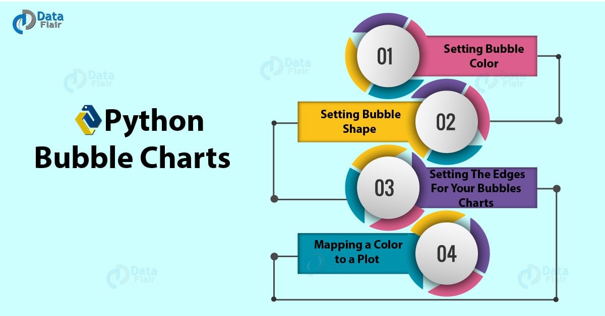
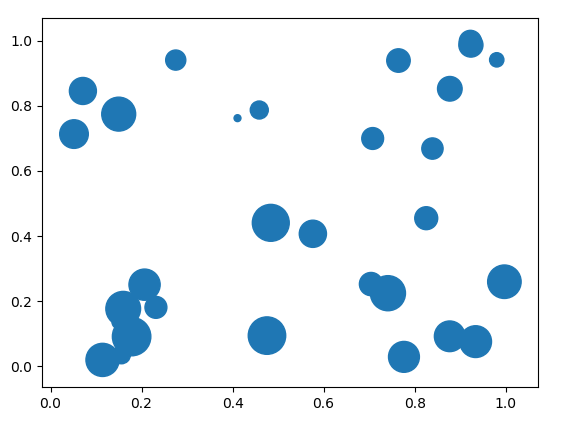
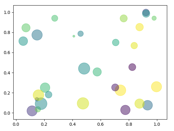
3. Python Bubble Charts
First, let’s talk about bubble charts in Python. Such a chart is a scatter plot with an extra dimension, which makes it apparently 3-dimensional. This means larger bubbles denotes higher values. Let’s build a Python bubble plot.
Python Charts – Python Bubble Charts
>>> x=np.random.rand(30)
>>> y=np.random.rand(30)
>>> z=np.random.rand(50)
>>> plt.scatter(x,y,s=z*777) #s is for global size
<matplotlib.collections.PathCollection object at 0x0863FAD0>
>>> plt.show()
Python Charts – Python Bubble Charts
a. Setting bubble color
Using the color parameter, you can assign a color to your bubbles chart.
>>> plt.scatter(x,y,s=z*777,c='Chartreuse')
<matplotlib.collections.PathCollection object at 0x0A258DB0>
>>> plt.show()
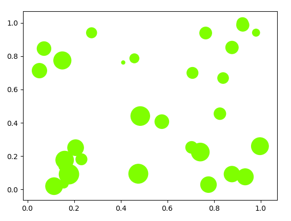
Python Charts – Setting bubble color
You can even assign random colors to different bubbles chart in Python.
>>> colors=np.random.rand(30)
>>> plt.scatter(x,y,s=z*777,c=colors,alpha=0.5) #alpha for transparency
<matplotlib.collections.PathCollection object at 0x0A295EF0>
Read about Python Datetime Module with Quick Examples
>>> plt.show()
Python Charts – Setting bubble color
b. Setting bubble shape
You can also choose what shape to apply to your bubbles chart.
>>> plt.scatter(x,y,s=z*3001,marker='D')
<matplotlib.collections.PathCollection object at 0x0A2D0E70>
>>> plt.show()
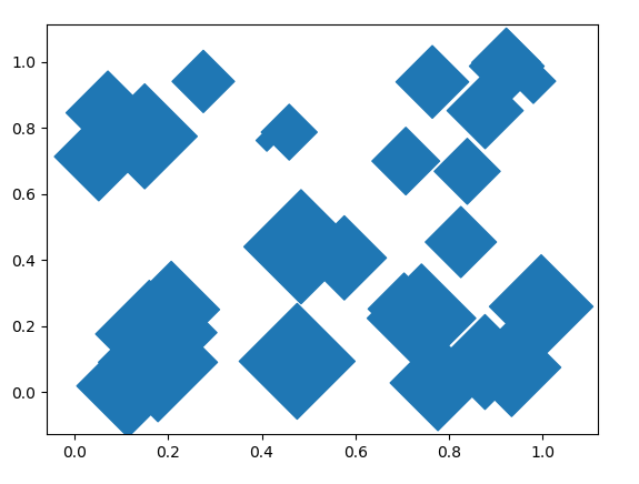
Python Charts – Setting bubble shape
>>> plt.scatter(x,y,s=z*3001,marker='<',color='brown')
<matplotlib.collections.PathCollection object at 0x09E15A50>
>>> plt.show()
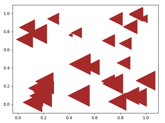
Setting bubble shape
>>> plt.scatter(x,y,s=z*3001,marker='*',color='pink')
<matplotlib.collections.PathCollection object at 0x09E508F0>
Have a Look at Python Forensics – Hash Function, Virtualization & much more
>>> plt.show()
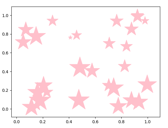
Setting bubble shape
>>> plt.scatter(x,y,s=z*3001,marker='8',color='lavender')
<matplotlib.collections.PathCollection object at 0x08B9AC90>
>>> plt.show()
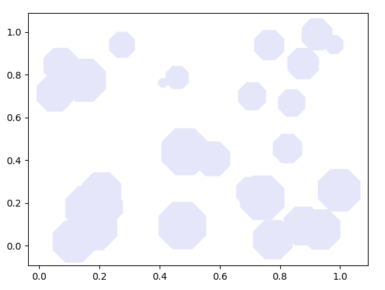
Setting bubble shape
c. Setting the edges for your Python bubbles charts
You can also set edges to your Python bubbles chart.
>>> plt.scatter(x,y,s=z*4000,c="beige",alpha=0.4,linewidth=7)
<matplotlib.collections.PathCollection object at 0x094035B0>
Do you know how to Implement Python Switch Case Statement
>>> plt.show()
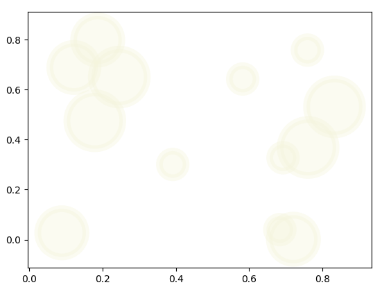
Setting the edges for your bubbles charts
>>> plt.scatter(x,y,s=z*4000,c="beige",linewidth=7,edgecolors='brown')
<matplotlib.collections.PathCollection object at 0x0A1EADD0>
>>> plt.show()
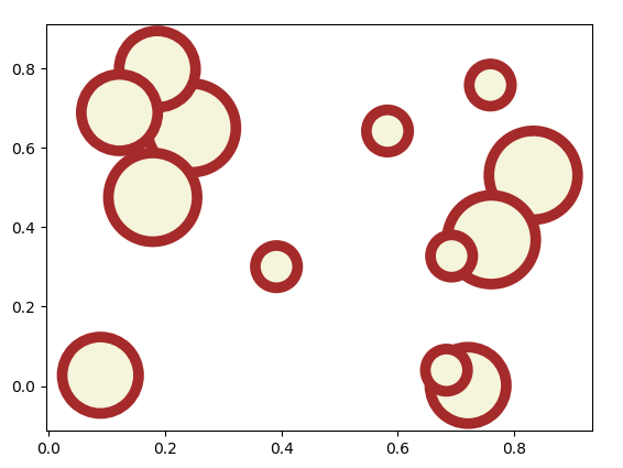
Setting the edges for your bubbles charts
d. Mapping a color to a plot
Let’s try mapping greys to it.
>>>plt.scatter(x,y,s=z*2000,c=x,cmap="Greys",alpha=0.4,edgecolors="grey",linewidth=2)
<matplotlib.collections.PathCollection object at 0x08AB91F0>
>>> plt.show()
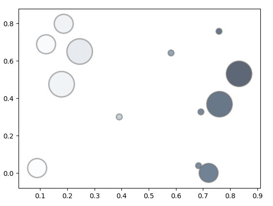
Mapping a color to a plot
4. Python 3D Charts
It is possible to render your Python charts in three dimensions. Here’s how we do that with Python 3D charts.
Let’s Learn Python Database Access – Python 3 MySQL
a. Python 3D Scatterplots
Here, we use the mplot3D toolkit from Python Matplotlib.
>>> from mpl_toolkits.mplot3d import Axes3D
>>> df=pd.DataFrame({'X':range(1,111),'Y':np.random.randn(110)*13+range(1,111), 'Z':(np.random.randn(110)*13+range(1,111))*2})
>>> fig=plt.figure()
>>> ax=fig.add_subplot(121,projection='3d')
>>> ax.scatter(df['X'],df['Y'],df['Z'],c='pink',s=60)
<mpl_toolkits.mplot3d.art3d.Path3DCollection object at 0x0A126CF0>
>>> ax.view_init(27,200)
>>> plt.show()
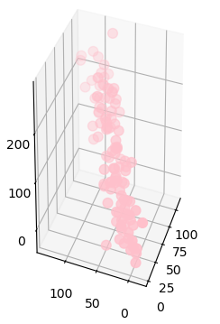
Python 3D Scatterplots
5. Python Charts Properties
Let’s demonstrate these online Python graphs.
Python Bubble Charts
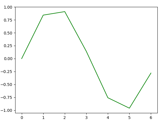
>>> x=np.arange(0,7)
>>> from scipy import sin
>>> y=sin(x)
>>> plt.plot(x,y)
[<matplotlib.lines.Line2D object at 0x0BEE0150>]
>>> plt.show()
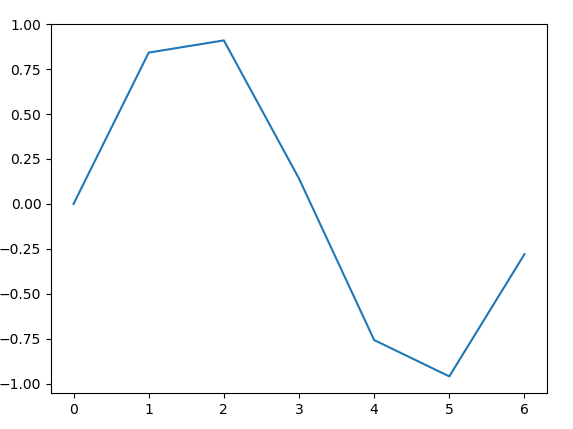
Properties of Charts in Python
a. Titling the graph and labeling the axes
Using the title(), xlabel(), and ylabel() methods, we can do the needful.
>>> plt.title('Sine Wave')Text(0.5,1,’Sine Wave’)
>>> plt.xlabel('x')Text(0.5,0,’x’)
>>> plt.ylabel('y')Text(0,0.5,’y’)
>>> plt.plot(x,y)
>>> plt.show()
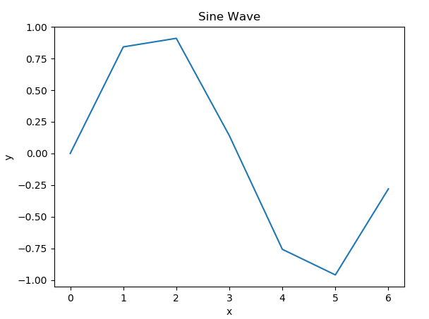
Titling the graph and labeling the axes
b. Setting line color and type
To set the line color, you use a Unicode character in the parameter list-
>>> plt.plot(x,y,'g')
[<matplotlib.lines.Line2D object at 0x045E6FF0>]
Setting line color and type
Now to set the line type, we can-
>>> plt.plot(x,y,'*')
[<matplotlib.lines.Line2D object at 0x0A0A4350>]
>>> plt.show()
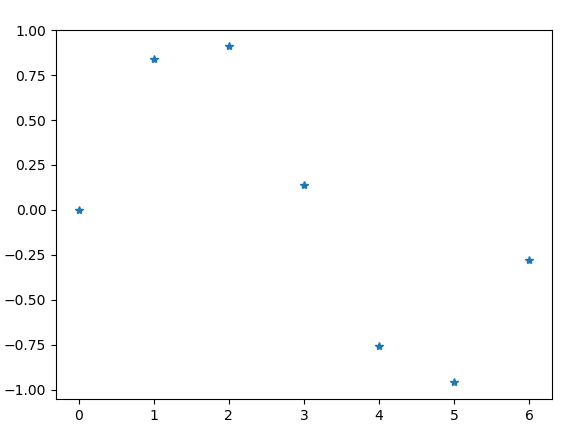
Setting line color and type
Now, what if we wanted to set both at once?
>>> plt.plot(x,y,'*g')
[<matplotlib.lines.Line2D object at 0x0A10B810>]
Follow this link to know about Python Data Cleansing by Pandas & Numpy
>>> plt.show()
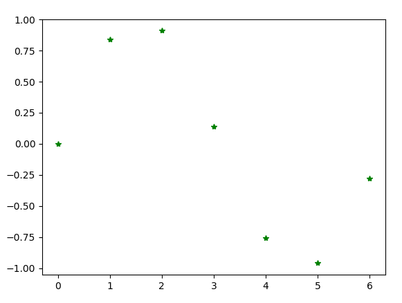
Charts in Python- Setting line color and type
‘g*’ gives us the same output.
6. Styling your Python Chart
Apart from fiddling with the properties of your charts in Python, you can also style it in a few different ways. Let’s see how.
Styling your Python Chart
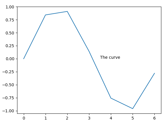
a. Adding Annotations
It is possible to drop in a label in your charts in Python wherever you want.
>>> x=np.arange(0,7)
>>> y=sin(x)
>>> plt.plot(x,y)
[<matplotlib.lines.Line2D object at 0x076DCB90>]
>>> plt.annotate(xy=[3.5,0],s='The curve') #You can add the annotations before plotting if you want
Text(3.5,0,’The curve’)
>>> plt.show()
Styling your Chart- Adding Annotations
Let’s Read about Python File I/O – Python Write to File and Read File
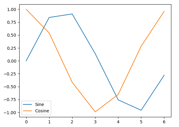
b. Adding Legends
>>> x=np.arange(0,7)
>>> y=sin(x)
>>> z=np.cos(x)
>>> plt.plot(x,y)
[<matplotlib.lines.Line2D object at 0x07D24530>]
>>> plt.plot(x,z)
[<matplotlib.lines.Line2D object at 0x07D248F0>]
>>> plt.legend(['Sine','Cosine'],loc=3)
<matplotlib.legend.Legend object at 0x07D249D0>
>>> plt.show()
Styling your Chart – Adding Legends
7. How to Save Python Charts File?
Finally, let’s see what you can do when you want to save a Python chart you’ve just created.
>>> plt.scatter(x,y,s=z*3001,marker='*',color='pink')
<matplotlib.collections.PathCollection object at 0x07D402F0>
>>> plt.savefig('pinkstars.pdf',format='pdf')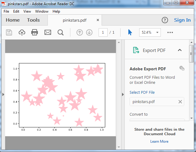
Python Charts File
How to Save Python Charts File Now we want to save this as a png. There is no need to make another call to plot(); simply save it.
Do you know about Python Multiple Inheritance – Python MRO
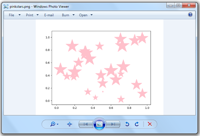
Saving Python Charts File
So, this was all about Python Charts Tutorial. Hope you like our explanation.
8. Conclusion
Hence, with this, we sum up our Python Charts tutorial on bubble charts and 3D charts in Python. Now you also know how to style Charts in Python, to make them aesthetically better and also aid understanding. Are there any more topics you would like us to write on? Let us know in the comments below.
Related Topic – Python Generator vs Iterator
For reference
Did we exceed your expectations?
If Yes, share your valuable feedback on Google