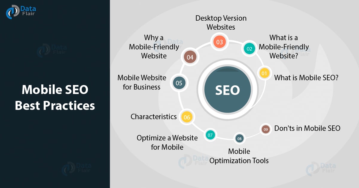
Build Your Mobile-Friendly Website – Mobile SEO Best Practices
FREE Online Courses: Transform Your Career – Enroll for Free!
Use of smartphones has become common these days to access the Internet. Most of the time people prefer smartphones to browse the Internet rather than PCs & laptops. That is why there is a need to make a Mobile-friendly website in order to increase the website’s visibility and gain more web traffic. Before you explore this tutorial, we recommend you to read how to design a website for SEO because only after this you will be clear with the concepts of constructing a mobile-friendly website.
1. What is Mobile SEO?
Mobile SEO refers to building a mobile-friendly website so that it can be viewed on smartphones where bandwidth is low and screen size is small as compared to desktops. This kind of technique is done to attract traffic and increase the website’s ranking in search engine result page (SERP).
2. What is a Mobile-Friendly Website?

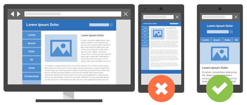
Since the size of all icons, logos and other calls to action buttons present on the desktop version of a website is different from a mobile website. A mobile-friendly website is specially designed to fit in the tiny and small screen size of mobile and tabs. A mobile-friendly website is easy to use and navigate having a smaller font and graphics size. There are some exclusive features that make mobile website different from desktop websites. Some of them are:-
- Easy to navigate button that is easily readable.
- A new feature called click to call exists only in the mobile websites that can make a call in just one touch.
- GPS navigation is also available in a mobile website.
3. Why Can’t You Use Desktop Version Websites on Smartphones?
Desktop and smartphones need a different version of websites as they use different bandwidth to upload the website’s page on the screen. If we access desktop version websites on mobiles then users find it very difficult in zooming in and out of the content. Therefore, desktop-based websites are difficult to open in smartphones and are not mobile friendly. It creates an undelightful and frustrating user experience, thereby, increasing the bounce rate.
4. Why Should You Build a Mobile-Friendly Website?
Recently, Google has made this a compulsion for every website to be built on a mobile-friendly platform. This is done to improve the visibility of the website by using every possible means. Not doing this will not only affect your ranking but can ban your website. So it’s better to be safe than sorry.
5. Characteristics of Mobile-Friendly Website
- The design of the website should work on both desktop and mobile platforms. The overall architecture of the website should be framed in such a way that its content can be adjusted and seen on both the platforms.
- The layout should be appropriate for smartphones. Texts, images, font, size should be easily readable on smartphones.
- Maneuverability is a very important factor for a mobile-friendly website. The user should be able to click on all buttons, links with the utmost ease.
- Keep a limited number of the plug-in to avoid downtime of the website for mobile uploads.
- Make sure to create a look-alike experience for the user on smartphones who have already accessed your website on a desktop.
You don’t have to worry if:-
- The loading time of your website on every device is the same regardless of taking the Internet into consideration.
- All clickable buttons and readable contents are visible without zooming in and out.
- Your website has some mobile platforms based on internal links and redirects.
- It creates a delightful user experience in terms of overall browsing.
7. How to Optimize a Website for Mobile
a. Separating the URLs
With this type of optimization, you have one desktop-based setup and one mobile based setup. Simplifying this means your website should know that user is browsing your website through which device i.e. Smartphones, desktops, etc. and then direct them to the URLs optimized for that device.
It is also known as “M” configuration.
Recommended Reading – Link Building for SEO
b. Dynamic Serving
It means giving access to the user based on the platform they are using to browse that particular website.
Let’s take an example if you are browsing content on www.dataflair.com via desktop then website will open on the desktop version of that website but if you are opening the same website using Smartphone then it will open the same website built on android or ios platform.
It means it can use HTML for desktop version and CSS for the mobile version to open the same website. But this technique is not reliable until and unless you have ‘M’ configuration.
c. Responsive Designing
This is the best technique as this technique allows each user to access the website’s content irrespective of the platform they are using. It gives freedom to access content using a single URL/HTML. It also provides great user experience with no redirects at all.
8. Mobile Optimization Tools
- Google search console: – Use mobile usability test option given on search console to know if your website has some issues. It is present in enhancement submenu on Google search console.
- Mobile Emulator: – It lets you know how your website is appearing on different mobile platforms.
- Moz local: – It tells you about your SEO work is done for mobile and other devices.
- Agent switcher: –This is an add-on that appears on Firefox internet browser that informs you how your content looks with different users.
- Screaming fog: – It gives a brief about all redirects used in your websites.
9. What You Should Avoid in Mobile SEO
Below are some things that you should avoid in SEO for Mobile –
a. Avoid using pop-ups: – Make sure to not use unusable, unplayable plug-ins and pop-ups like the flash that can increase downtime of your website. It becomes very irritating for the user to deal with all those pop-ups.
b. Avoid error 404: – If your website has some content or redirects that can’t be displayed on mobile then redirect your user with some other URL instead of showing them error 404.
c. Heavy graphics: – Avoid using heavy images and graphics as that can increase your website’s loading time and can increase the bounce rate. However, it is not possible to eliminate them as they also enhance your content. It is advisable to put images relevant to the content and avoid overstuffing.
d. Page speed: – Uploading or downloading any data also depends on internet speed but if your website is too slow that means it is having some error that needs to be solved. You can run a test on the search console to find out all the bugs.
10. Summary
If you want your website to be highly optimized for mobile then try not to frustrate the user and try to give it a delightful experience by giving exactly what the user expects from a desktop’s version website. Don’t add non-playable videos which need flash players and constant upgrades. Mobile web pages that provide bad user experience can demote your website’s ranking.
Still, if you have any questions, ask in the comment section.
Did you know we work 24x7 to provide you best tutorials
Please encourage us - write a review on Google